
Using HTML Lists tag like a Pro
Squared Shape, Circled Shape, and more...
5 years ago
3 mins readHello 👋, my gorgeous friend on the internet, how are you doing today?
(you can reply in the comment section below 👇).
This weekend we are going to be looking into making our HTML list more attractive on our web projects, that's what you will learn from this article 💃.
We will be building together
- The Squared List
- The Circled List
- The Diamond List, and
- The Oval List
Without any further ado, let's get started.

The source code will be provided in this article so you can check out the live samples on your browser.
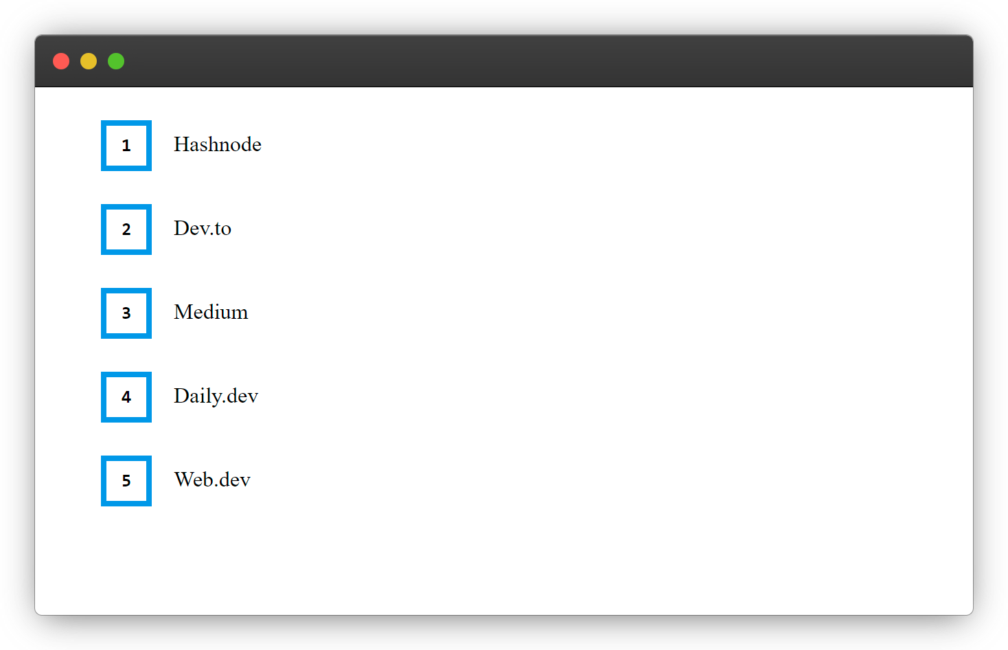
1. The Squared List
Lists of Blogging sites.
HTML
    <ul class="squared-list">
        <li>Hashnode</li>
        <li>Dev.to</li>
        <li>Medium</li>
        <li>Daily.dev</li>
        <li>Web.dev</li>
    </ul>
CSS
.squared-list{
    list-style: none;
    counter-reset: list-counter;
}

.squared-list li{
    margin: 1.5rem 0;
}

.squared-list li::before{
    counter-increment: list-counter;
    content: counter(list-counter);
    display: inline-block;
    font-weight: bold;
    width: 1rem;
    height: 1rem;
    padding: .5rem;
    margin-right: 1rem;
    color: #000;
    border: .25rem solid #2696E8;
    font-family: monospace;
    text-align: center;

}
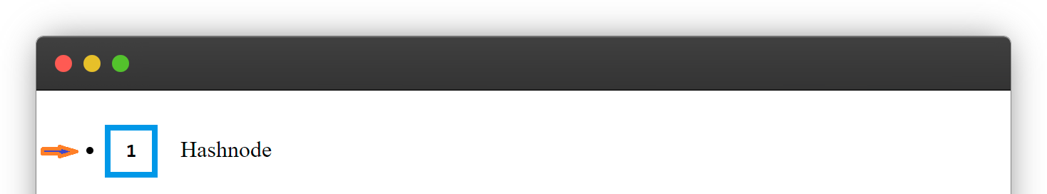
Explanation
1. list-style: none;
list-style: none; /* Line 2 */
This helps to remove the default dot from the lists.
2. counter-reset: list-counter;
counter-reset: list-counter; /* Line 3 */
This is to create and keep track of the CSS counter.
3. counter-increment: list-counter;
counter-increment: list-counter; /* Line 11 */
To Increase the list counter <li> via the list counter we created.
4. .squared-list li::before
.squared-list li::before /* Line 10 */
This is to insert the generated counter before the lists <li>.
To know more about how
::before works check out the article below
More Examples
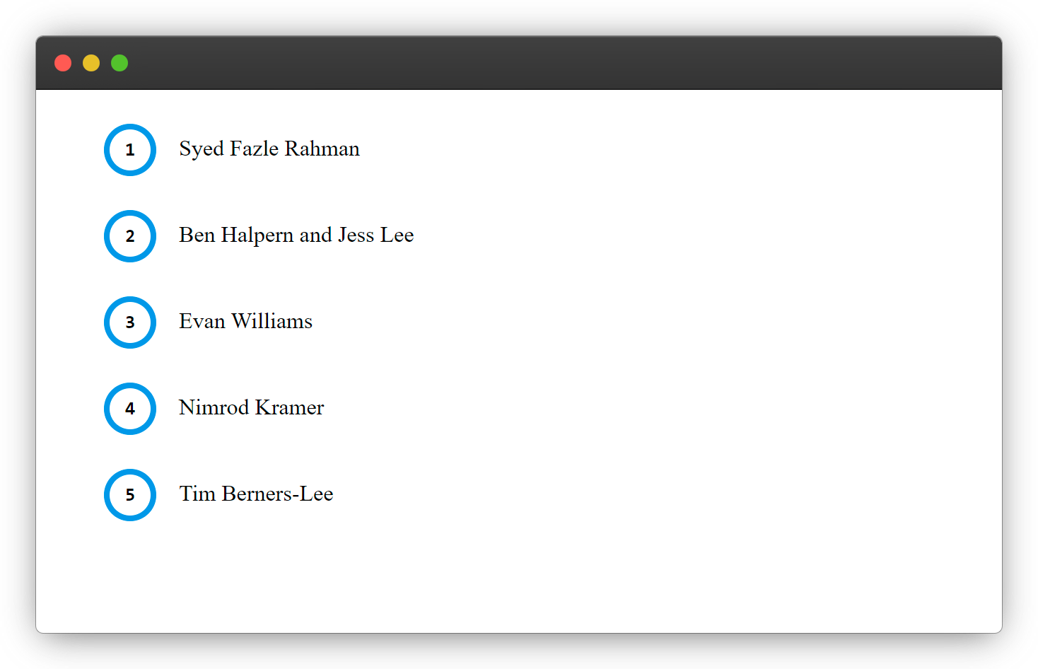
2. The Circled List
Lists of founders of the above Listed Blogging sites.
CSS
To make an awesome Circled List give the ::before a border-radius like below.
/* Change the squared-list class name to circled-list for good naming convention */
.squared-list li::before{

    /* New Line */
    border-radius: 50%;
}
cool right? 😎
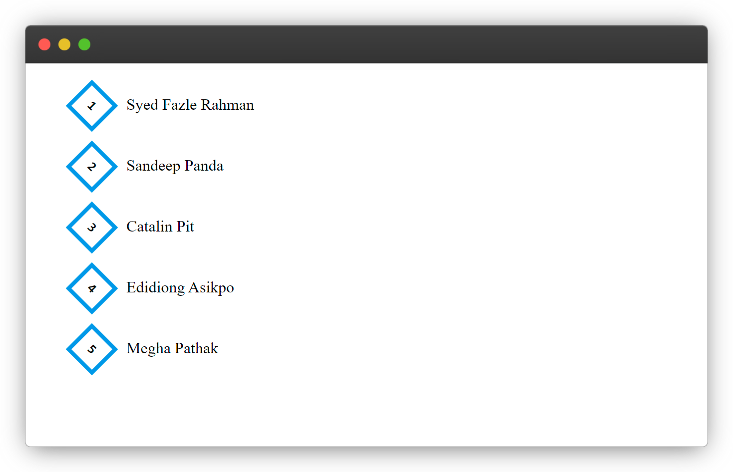
3. The Diamond List
Lists of Hashnode Team.
CSS
/* Change the squared-list class name to diamond-list for good naming convention */
.squared-list li::before{

    /* New Line */
    transform: rotate(45deg);
    text-transform: rotate(90deg);
}
And finally 😀
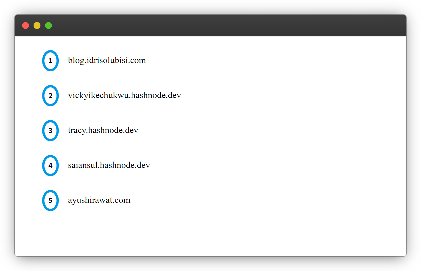
4. The Oval List
Lists of amazing blogging sites on hashnode
CSS
/* Change the squared-list class name to oval-list for good naming convention */
.squared-list li::before{

    /* New Line */
    border-radius: 50%;
    width: .5rem;
}
CONCLUSION
You have learned how you can transform the basic list <li> tag to a wow-some list in this article, you can do more with this by researching more on HTML list styling.
The End

Wow, what a journey, I am glad you made it to the end of this article, if you enjoyed and learned from this article, I will like to connect with you, so you won't miss any of my upcoming articles.
Let's connect on
See you in the next article. Bye Bye 🙋♂️

If you like my content, you can also tip me below.
Enjoyed this article?
Subscribe to my YouTube channel for coding tutorials, live project builds, and tech discussions.
Subscribe