
How To Create An Hover Underline Animation In CSS
4 years ago
4 mins readThe little things matter sometimes. You never know how satisfied your website visitors or clients maybe with the minor adjustments you make, like adding a Hover Underline Animation to your website.
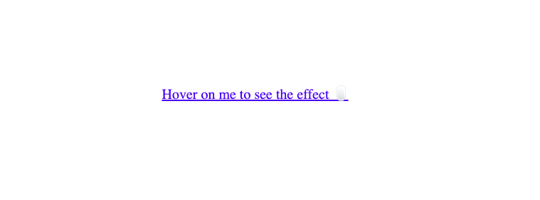
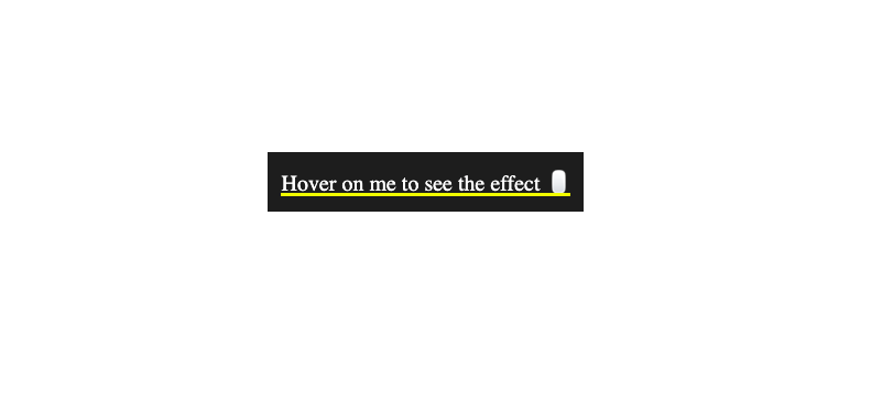
In this tutorial, you'll learn how to improve your website links from this (an HTML link without the hover underline animation):
To this (an HTML link with the hover underline animation):
You can check out the Codepen here.
The HTML Part
Let's say, you have this HTML anchor tag below to navigate a user to another webpage:
<nav>
  <a href="#" class="hover-underline-animation">
    Hover on me to see the effect 🖱
  </a>
</nav>
By default, the code above will produce this:
Let's add some CSS styles to them:
nav{
  background: #202020;
  padding: 10px;
}

.hover-underline-animation {
  position: relative;
  color: #FFFFFF;
  text-decoration: none;
}
From the CSS code above:
We gave the
navtag a blackish background color and padding to create a 10px space around its content.We also made the anchor link be positioned relative because we'll later add an absolute positioned pseudo-element after it.
Finally, we made the anchor link white for visibility on the black background and removed the default underline with the
text-decorationproperty.
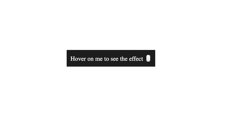
Our anchor link should now look something like this:
Step 1 - Adding An Underline To The Anchor Tag Text
In order to achieve the underline effect, we'll make use of the ::after pseudo-element to create a custom underline for the anchor link because we can't really modify the default underline that comes with it and this method will make it easy to add the hover underline animation effect to any other text.
Update your CSS with the code below:
.hover-underline-animation::after {
  content: '';
  position: absolute;
  width: 100%;
  height: 2px;
  bottom: 0;
  left: 0;
  background-color: #ffff00;
  transform-origin: bottom right;
  transition: transform 0.25s ease-out;
}
From the CSS code above:
We targeted the
::afterpseudo-element of the anchor tag to create an underline effect on the text.Next, we specified the transform property of the underline to move from left to right at the bottom of the element it's positioned with the specified transition property (we'll add the transform property later).
Our anchor tag should look something like this:
Step 2 - Hidding The Text Underline By Default
Since we only want the anchor tag to be underlined when hovered, we can add the transform scaleX() CSS function to hide it by default.
The scaleX() CSS function defines a transformation that resizes an element along the x-axis (horizontally) - MDN
.hover-underline-animation::after{
  ...
  transform: scaleX(0);
}
Setting the scaleX(); function to 0 will make the element to be invisible. We can then increase the value when a user hovers on the anchor link.
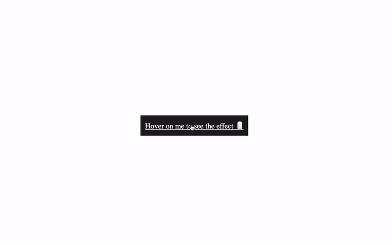
Now we have the underline hidden by default, as shown below:
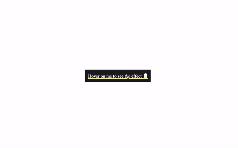
Step 3 - Displaying The Text Underline On Mouse Hover
The final step is to display the text underline on the mouse hover and here's what the code looks like:
.hover-underline-animation:hover::after {
  transform: scaleX(1);
}
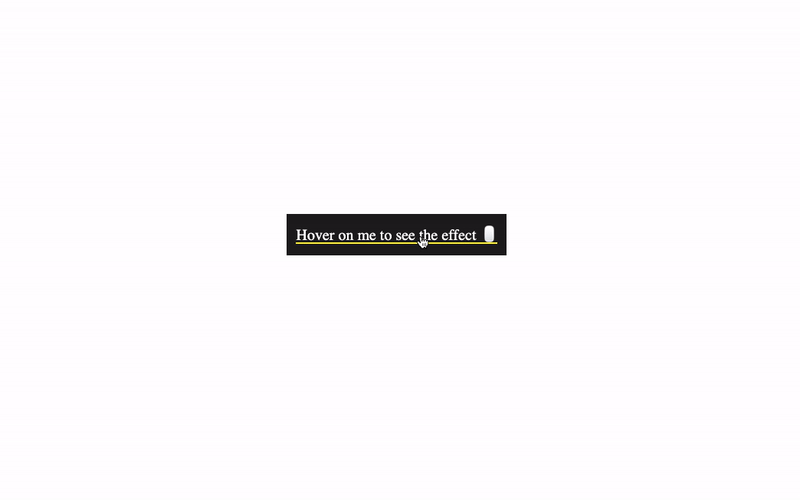
Now, the underline should be visible on mouse hover like this:
You'll notice that the underline animation only moves in one direction (came from the bottom-right and exits through the bottom-right), this is from the transform-origin property that we declared earlier.
We can improve the hover underline animation by adding the opposite value of the initial transform-origin to the hover state as well. Like this:
.hover-underline-animation:hover::after {
  ...
  transform-origin: bottom left;
}
This will make the underline come from the bottom left and then exit through the bottom right, as shown below:
You can find the complete code here
Wrapping Up 🏁
In this tutorial, you've learned how to add a hover underline animation to improve the anchor tags and texts on your website.
Useful Links
Learn more about the
scaleXCSS function hereLearn more about the
::beforeand::afterCSS pseudo elements from here
Learn how to code (in 2024) with me. Checkout my YouTube channel below:
I'm glad you made it to the end of this article. If you enjoyed and learned something new from this article, I'll like to connect with you.
Let's connect on:
See you in the next article. Bye Bye 🙋♂️
If you found my content helpful and want to support my blog, you can also buy me a coffee below, my blog lives on coffee 🙏.
Enjoyed this article?
Subscribe to my YouTube channel for coding tutorials, live project builds, and tech discussions.
Subscribe