
How To Create A Donut Spinner With HTML and CSS
4 years ago
4 mins readA donut spinner is one of the popular loading components that is used on a website. It's useful to indicate to the user that the page is still loading or that data is currently being fetched.
In this tutorial, we'll take a look at how to build a custom donut spinner for a loading page with HTML and CSS. The loading page will be the first thing a user will see before the page is fully loaded.
Demo 📺
Here's a video sample of what a loading page with a custom donut spinner looks like:
Codepen here.
We'll divide this build into two parts; the HTML part and the CSS part.
The HTML Part
In this part, we're going to create an HTML element to represent our donut spinner.
Here's what it looks like:
<section class="page">

  <div class="donut-spinner">Page still loading</div>

</section>
The page section is the parent container and it represents the whole loading screen, we need this to align the donut-spinner vertically and horizontally on the page using the CSS flexbox property.
The donut-spinner is our page main loader, we'll make this a circle and spinning in the CSS part.
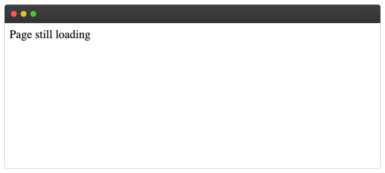
Our HTML loading page should look something like this:
The CSS Part
In this part, we'll style the page to take the screen full width and height and align the donut-spinner to the center.
We can achieve this with the flexbox and the min-height property, as shown below:
.page{
  display: flex;
  align-items: center;
  justify-content: center;
  min-height: 100vh;
}
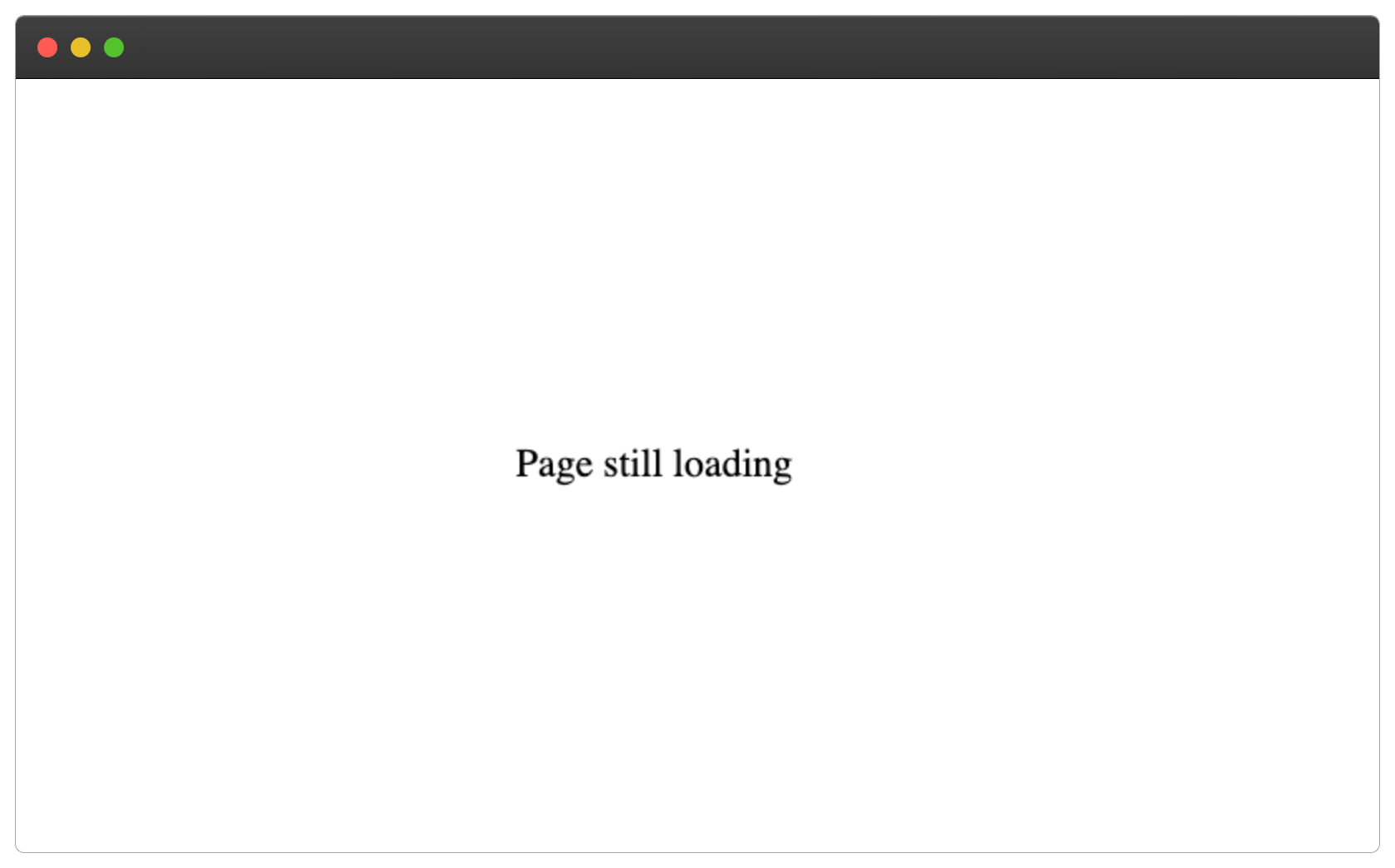
The CSS properties above will make the content inside of the page section to be vertically and horizontally aligned, as shown below:
Step 1 - Building The Donut Spinner
To this point, we only have a loading text on the loading page, this is not what we want. We'll design the donut spinner below.
Firstly by adding a height and width property:
.donut-spinner {
  width: 40px;
  height: 40px;
  border: 4px solid rgba(0, 0, 0, 0.1);
  border-left-color: #7983ff;
}
Ensure the height and width have the same value, in order to have a perfect square share like this:
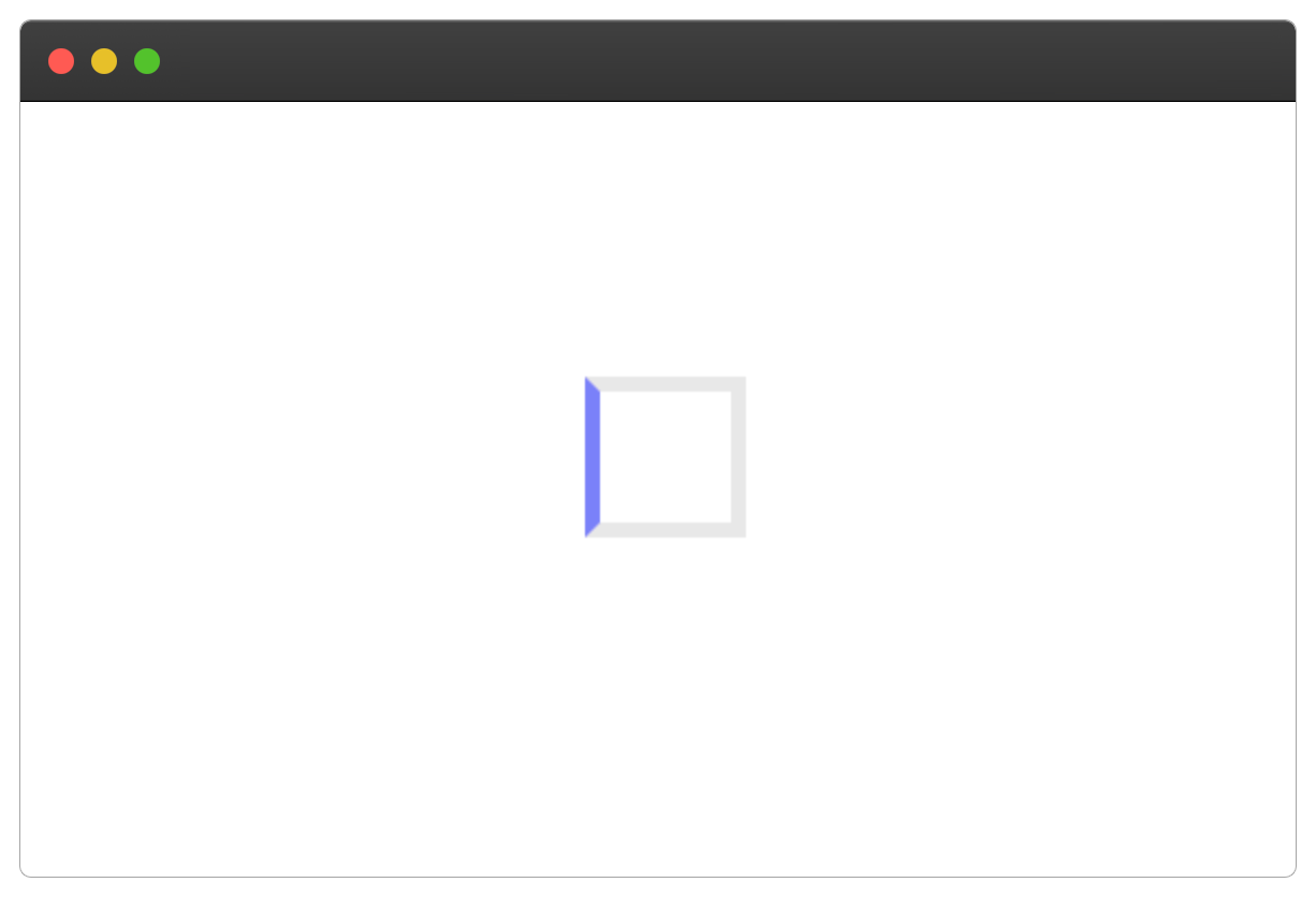
Remove the "Page still loading" text.
We only need one side of the donut spinner to be colored, that's why we're targeting the left border of the square.
Next, we'll make the square a circle by setting its border-radius property to be 50%
border-radius: 50%;
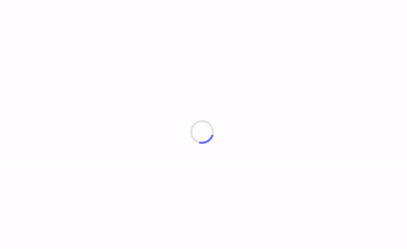
This will produce the following:
Looks good 🎉.
Step 2 - Adding Animation To The Donut Spinner
Now that we've layout our donut spinner, let's add a spinning animation to it.
We'll specify our CSS animation inside the @keyframes donut-spin and then make our donut spinner rotate from 0 degrees to 360 degrees by using the CSS transform property.
Here's how:
@keyframes donut-spin {
  0% {
    transform: rotate(0deg);
  }
  100% {
    transform: rotate(360deg);
  }
}
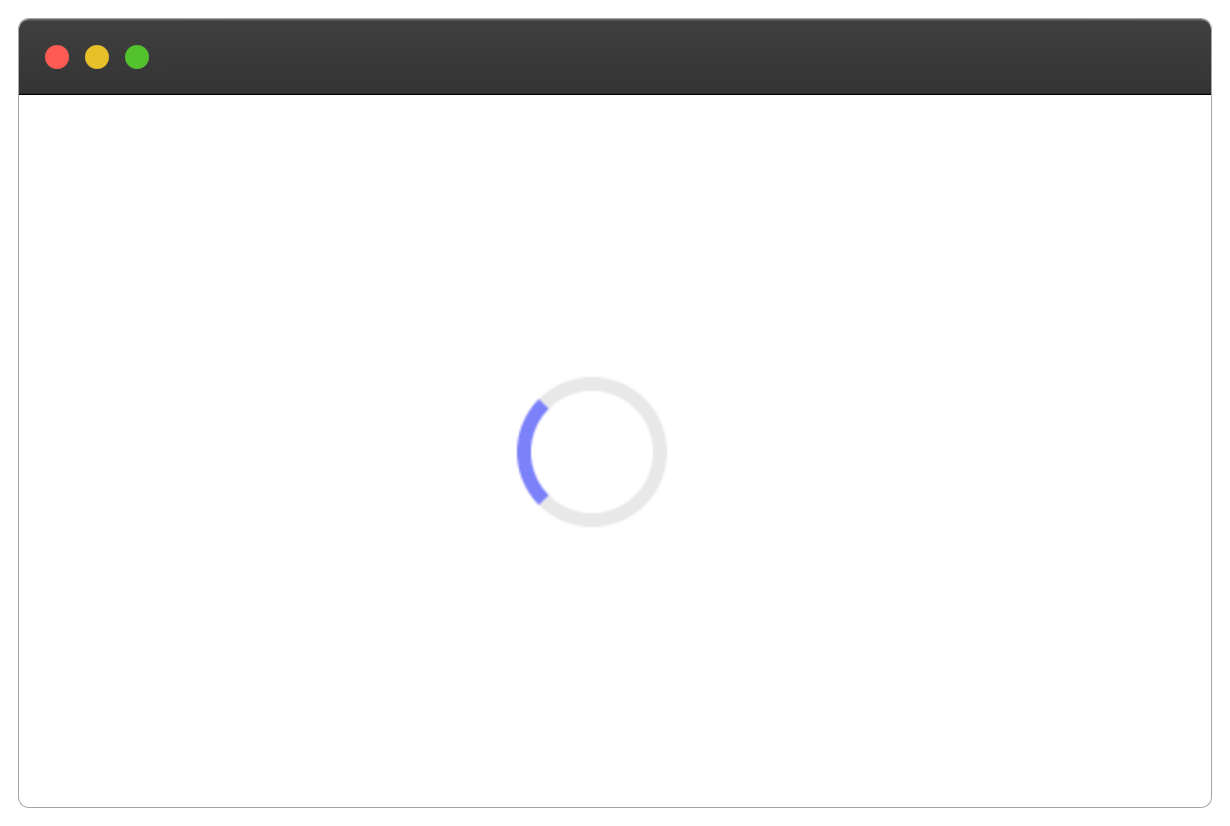
Finally, we can apply the donut-spin keyframe to our donut-spinner through the CSS animation property, as shown below:
.donut-spinner {
  /* .... */
  animation: donut-spin 1.2s linear infinite;
}
The donut spinner will apply the donut-spin and take 1.2s to complete in linear time till infinity.
Our loading page should have a donut spinner that looks something like this:
Complete Code
You can check out the complete code on Codepen here or copy and paste the code below with the JavaScript part:
<!DOCTYPE html>
<html lang="en">
  <head>
    <meta charset="UTF-8" />
    <meta http-equiv="X-UA-Compatible" content="IE=edge" />
    <meta name="viewport" content="width=device-width, initial-scale=1.0" />
    <title>Donut Spinner</title>

    <!-- CSS PART -->
    <style>
      .page {
        display: flex;
        align-items: center;
        justify-content: center;
        min-height: 100vh;
      }

      @keyframes donut-spin {
        0% {
          transform: rotate(0deg);
        }
        100% {
          transform: rotate(360deg);
        }
      }
      .donut-spinner {
        width: 40px;
        height: 40px;
        border: 5px solid rgba(0, 0, 0, 0.1);
        border-left-color: #7983ff;
        border-radius: 50%;
        animation: donut-spin 1.2s linear infinite;
      }
    </style>
  </head>
  <body>
    <!-- HTML PART -->
    <section class="page">
      <div class="donut-spinner"></div>
    </section>

    <!-- JAVASCRIPT PART -->
    <script>
      const loadPage = () => {
        const donutSpinner = document.querySelector(".donut-spinner");
        const page = document.querySelector(".page");

        setTimeout(() => {
          donutSpinner.style.display = "none";
          page.innerHTML = "Page is fully loaded";
        }, 5000);
      };

      loadPage();
    </script>
  </body>
</html>
Wrapping Up 🏁
In this tutorial, you've learned how to create a custom donut spinner using HTML and CSS.
I'm glad you made it to the end of this article. If you enjoyed and learned something new from this article, I'll like to connect with you.
Let's connect on:
See you in the next article. Bye Bye 🙋♂️
If you found my content helpful and want to support my blog, you can also buy me a coffee below, my blog lives on coffee 🙏.
Enjoyed this article?
Subscribe to my YouTube channel for coding tutorials, live project builds, and tech discussions.
Subscribe