
Data Visualization with Chart.js
Getting Started with Chart.js; Task-Based Learning
4 years ago
14 mins readHello my gorgeous friend on the internet, I have written this article specially for you to guide you on how to get started with data visualization using chart.js.
Shall we?
Prerequisites
Before you continue with this tutorial article, you should:
- Have working experience with JavaScript
- Know the basics of HTML attributes such as an id and class
- Have a code editor (I will be using VSCode )
Introduction
One of the most important features that a developer should be able to implement on a web application is a diagrammatic representation of data, which allows users to have a clear visual of data on a website.
Whether it's financial data, page view analytics, or statistics of items, which are mostly found on the dashboard.
In this tutorial article, we'll learn how to make use of chart.js to create a visual representation of data in JavaScript.
Demo
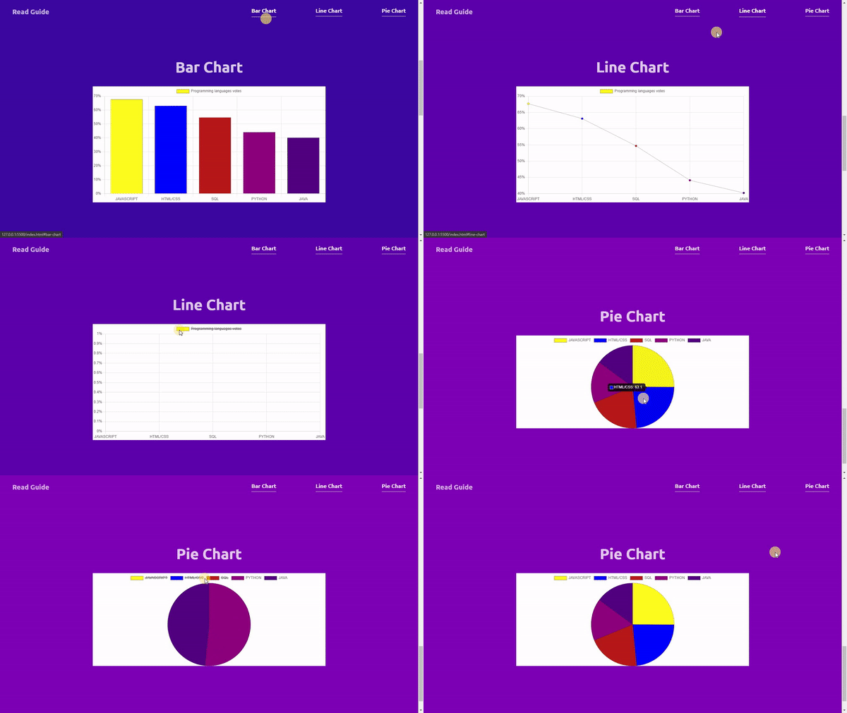
You can check out the demo of what we will be building together in this article here.
Or watch the demo video below.
What is Chart.JS?
Chart.js is an open source JavaScript library that is used for data visualization that supports up to eight different charts including the bar chart, line chart, area chart, pie chart, bubble chart, radar chart, polar chart, and scatter chart.
For this tutorial, we will be focusing on the bar chart, line chart, and pie chart, and at the end of this article, you will learn how to implement these three charts.
Getting Started with Chart.js
There are three major ways of adding chart.js to your project:
1. Through Package Manager (Highly recommended)
You can install Chart.js through npm, yarn, or any other package manager installer for your Node, React, Vue, Angular, or any other supporting frameworks.
2. Through CDNJS (Recommended)
Another way of adding chart.js to a project is through the Content Delivery Network, which means all the built files of chart.js can be accessed directly from the cdnjs or jsDelivr.
3. Through GitHub (Less recommended)
Chart.js is an open source project, which means you can download the latest version of chart.js directly from GitHub here, but this method requires you to fork, clone, build and test the chart.js before getting it to work on your machine, this method is way too tedious.
In this tutorial, we will be making use of the cdnjs method to add chart.js to our project, you can always try out other methods on your own using this guide.
How Chart.js Works in HTML
In this section, I will lay out how chart.js works and explain the minimum things you need to set up a chart with the chart.js library.
I will break this section down into two parts; The HTML part and The JavaScript part.
The Html Part:
This part involves importing the chart.js cdn link into your html document and setting up a <canvas> html tag.
The <canvas> html tag is used to draw graphics on a web page using JavaScript, now you understand why there are two parts to cover when working with chart.js.
1. Import chart.js cdn in your HTML document.
You can get the latest version of chart.js from here.
<!-- Chart.js Script -->
<script src="Chart-cdn-goes-here"></script>
2. Specify where you what to display the chart in your HTML document, also note that it is very important to wrap the canvas tag inside of a container, as the canvas tag needs the parent container to make the chart responsive, we will address this issue later in this guide.
The canvas id will be used later to make reference to the canvas element in the JavaScript part.
<section class="chart-wrapper">
  <!-- chart canvas -->
  <canvas id="chart-name"></canvas>
</section>
The JavaScript Part
Welcome to the JavaScript part, there are a couple of things that are common and important when working with any chart in chart.js, this includes;
- The canvas reference to display the chart.
- The chart configuration.
- The chart type.
- The chart labels, the horizontal labels of the chart.
- The chart datasets.
- The chart data, the vertical labels of the chart.
- The chart label, which is the title or name of the chart.
- The chart instance, which is needed to initiate a new type of chart.
Let me show you the code.
// 1. The canvas reference to display the chart.
const chartCanvas = document.getElementById('chart-canva').getContext('2d');

// 2. The chart configuration.
const config = {
  type: 'bar', // chart type
  data: {
    // The chart labels, the horizontal labels of the chart.
    labels: ['label-1', 'label-2', 'label-3', 'label-4', 'label-5'],

    // The chart datasets
    datasets: [
      {
        // The chart data, the horizontal labels of the chart.
        data: [67.7, 63.1, 54.7, 44.1, 40.2],

        // Chart label
        label: 'Chart Label',
      },
    ],
  },
  // Canvas are not responsive by default
  options: {
    responsive: true,
  },
};

// 3. The chart instance, which is needed to initiate a new type of chart.
const newBarChart = new Chart(chartCanvas, config);
The getContext('2d') gives us access to the 2D drawing on the canvas HTML tag, this configuration is optional and document.getElementById('chart-canva') is enough.
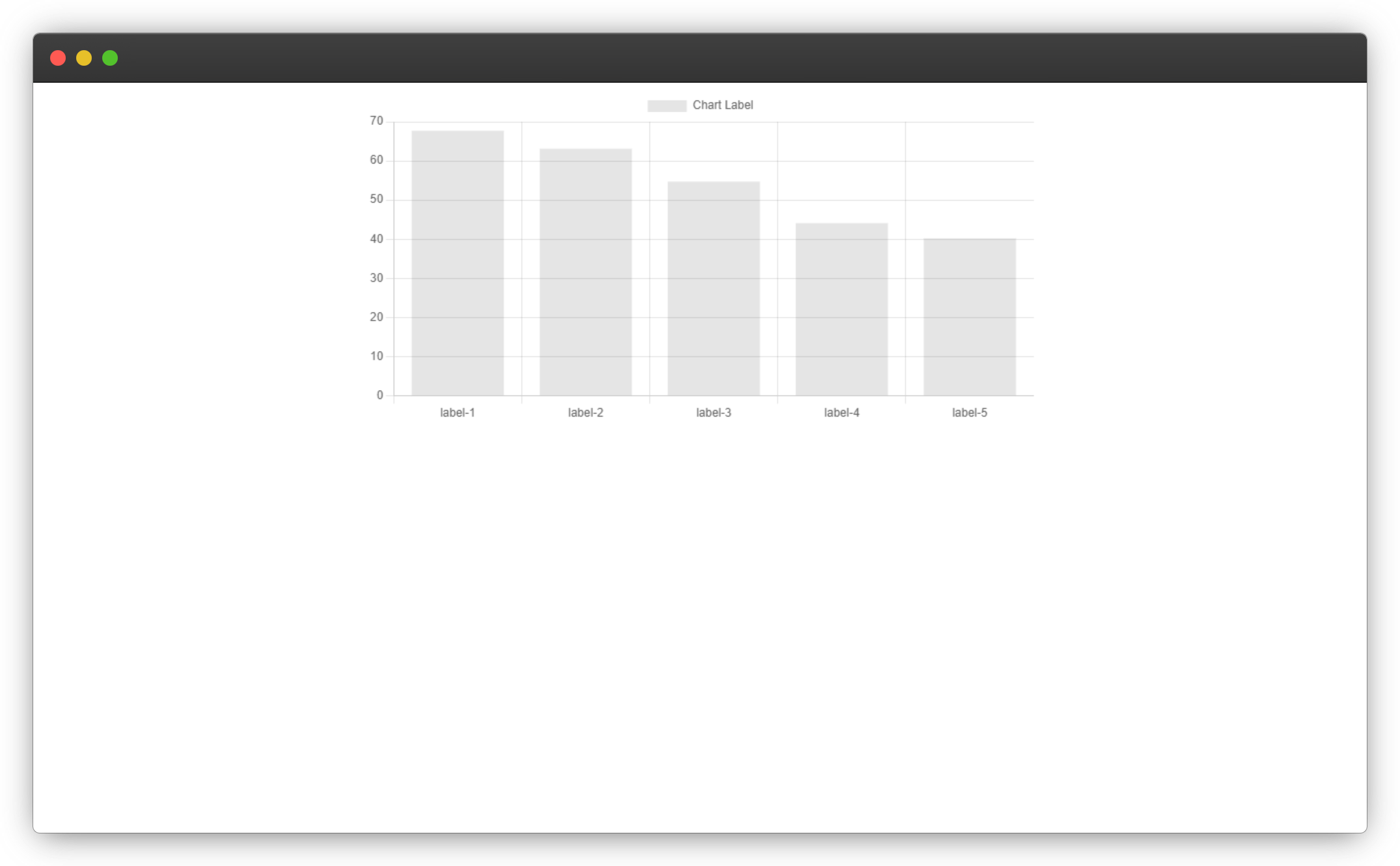
The code above will produce the output below:
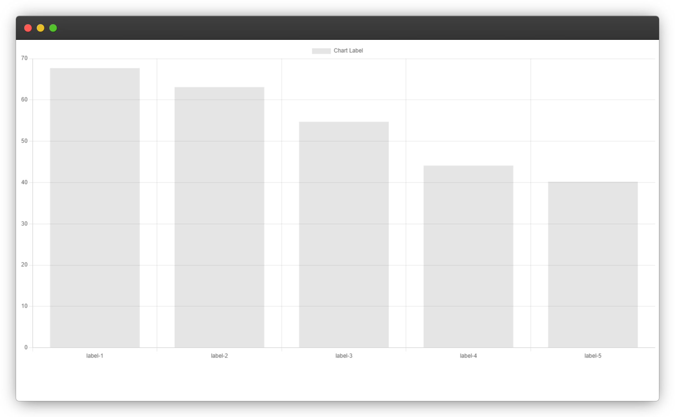
And that's not responsive, the canvas tag is not responsive by default, and we might need a small size chart for our application, the chart.js has a configuration option named responsive, which you need to set to true for the chart to resize when the parent container or element resizes, this will make the chart take the width and height of its parent element.
The methods below do not work 😢
<canvas width="50vw" height="50vh"></canvas>
<canvas style="width: 50vw; height: 50vh;"></canvas>
The code below demonstrates how to make your charts in chart.js responsive.
<section class="chart-wrapper">
   <!-- chart canvas -->
   <canvas id="chart-name"></canvas>
</section>

<style>
   .chart-wrapper {
      position: relative;
      width: 50vw;

      /* align at page center*/
      margin: 0 auto;
   }
</style>
The chart wrapper position should be set to relative for the chart to be responsive with the container across different sizes.
Now we have a responsive bar chart.

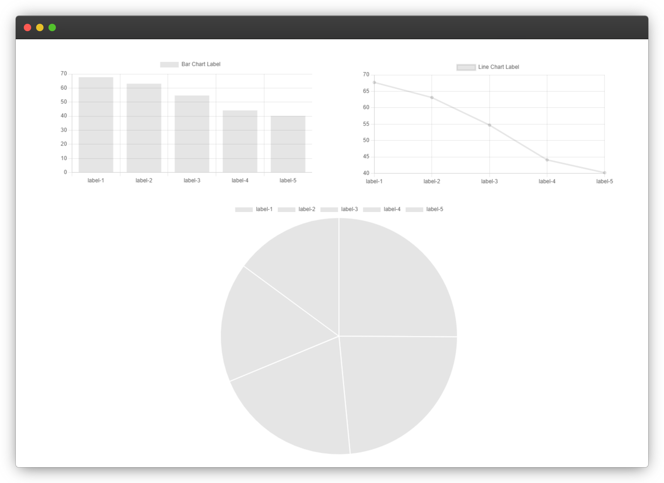
So far, working with chart.js is not as difficult as it seems, right? All you need to get started with any type of chart are what has been demonstrated above, you can go ahead and change the type of chart to line, pie, or any other type of chart.
And you should have the corresponding charts displayed on your screen.
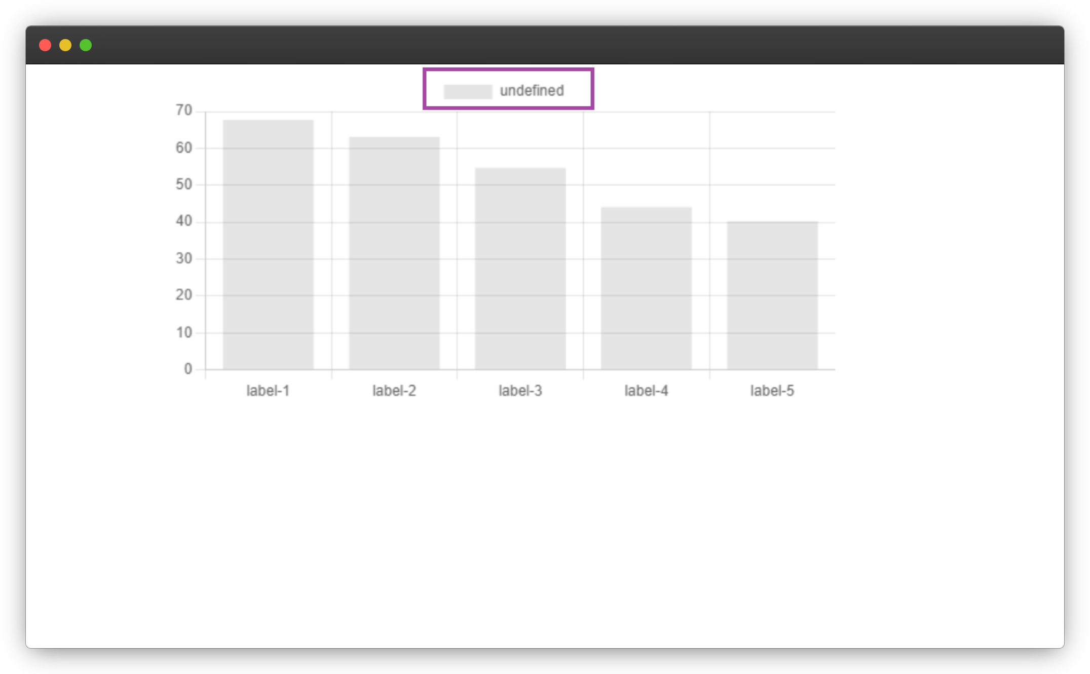
The chart label will be undefined if the label is not set as shown below.
Down to this point, we have learned the concepts to build any type of chart using chart.js and with these concepts at your reach, you will be able to handle any chart in chart.js.
In the next section, we'll use a real-world use case of charts to visualize data and also add styles to our not-so-cute charts.
Task
Let's apply what we've learned to a real-world scenario: Our task is to display the most popular technologies from the 2020 Stack Overflow Developer Survey results using a Bar Chart, Line Chart, and Pie Chart.
Result of the Most Popular Technologies Survey.
| Technology | Vote Percentage |
| JAVASCRIPT | 67.7% |
| HTML/CSS | 63.1% |
| SQL | 54.7% |
| PYTHON | 44.1% |
| JAVA | 40.2% |
We won't go into detail about the CSS part of the solution because this tutorial is focused on building charts with the chart.js JavaScript library.
Copy and paste the HTML and CSS code below as a starter kit, most CSS styles are just to make our page look more attractive.
<!DOCTYPE html>
<html lang="en">

<head>
    <meta charset="UTF-8">
    <meta http-equiv="X-UA-Compatible" content="IE=edge">
    <meta name="viewport" content="width=device-width, initial-scale=1.0">
    <link rel="stylesheet" href="./chart.css">
    <title>Getting Started with chart.js</title>
</head>

<body>

    <!-- HEADER SECTION -->
    <header>
        <!-- NAVBAR SECTION -->
        <nav>
            <a href="" class="nav-links read-guide">Read Guide</a>
            <div class="nav-right">
                <a href="#bar-chart" class="nav-links">Bar Chart</a>
                <a href="#line-chart" class="nav-links">Line Chart</a>
                <a href="#pie-chart" class="nav-links">Pie Chart</a>
            </div>
        </nav>
        <!-- HERO SECTION -->
        <section class="hero">
            <h1 class="hero-text">Getting Started with Chart.js <br /> (DEMO)</h1>
        </section>
    </header>

    <main>
        <!-- Charts goes in here -->
    </main>

    <footer>
        <h2>Design with 🧡 by <span>UNCLEBIGBAY</span></h2>
    </footer>


    <!-- Chart.js Script -->
    <script src="https://cdnjs.cloudflare.com/ajax/libs/Chart.js/3.6.0/chart.min.js"
        integrity="sha512-GMGzUEevhWh8Tc/njS0bDpwgxdCJLQBWG3Z2Ct+JGOpVnEmjvNx6ts4v6A2XJf1HOrtOsfhv3hBKpK9kE5z8AQ=="
        crossorigin="anonymous" referrerpolicy="no-referrer"></script>

    <!-- Bar Chart Script -->
    <script src="./bar-chart.js"></script>
    <!-- Line Chart Script -->
    <script src="./line-chart.js"></script>
    <!-- Pie Chart Script -->
    <script src="./pie-chart.js"></script>
</body>

</html>
Create the following files: chart.css, bar-chart.js, line-chart.js, and pie-chart.js, we will be writing our code in them very soon.
Open your chart.css file and put the CSS code below inside.
@import url('https://fonts.googleapis.com/css2?family=Ubuntu:ital,wght@0,300;0,400;0,500;0,700;1,300;1,400;1,500;1,700&display=swap');

* {
  margin: 0;
  box-sizing: border-box;
}

:root {
  --primary-color: #0b0d60;
  --app-white: #ffffff;
  --bar-chart-bg: #3a0ca3;
  --line-chart-bg: #560bad;
  --pie-chart-bg: #7209b7;
}

html {
  scroll-behavior: smooth;
}

body {
  line-height: 1.3;
  font-family: 'Ubuntu';
  background-color: var(--pie-chart-bg);
}

header {
  padding: 0.9rem;
  background-color: var(--primary-color);
  height: 100vh;
}

/* FIX THE NAVBAR ACROSS ALL SECTIONS */
nav {
  position: fixed;
  left: 0;
  width: 100%;
  z-index: 9;
  display: flex;
  flex-direction: column;
  justify-content: space-between;
}

.nav-links.read-guide {
  opacity: 1;
  font-size: 22px;
  margin-bottom: 0.6rem;
  text-decoration-line: unset;
  opacity: 0.7;
}

.nav-links.read-guide:hover {
  opacity: 0.9;
}

.nav-right {
  display: flex;
  justify-content: space-between;
  width: 100%;
}

.nav-links {
  padding: 0.5rem;
  color: #fff;
  text-decoration: none;
  opacity: 0.9;
  font-size: 1.1em;
  font-weight: 600;
  transition: 0.5s;
  text-decoration-line: underline;
  text-underline-offset: 10px;
}

.nav-links:hover {
  opacity: 1;
  text-underline-offset: 12px;
}

/* HERO SECTION */

.hero {
  display: flex;
  justify-content: center;
  align-items: center;
  height: 100%;
  text-align: center;
}

.hero-text {
  color: #fff;
  font-size: 48px;
  line-height: 1.5;
}

/* CHART SECTION */

.chart-section {
  height: 100vh;
  padding-top: 70px;
  display: flex;
  flex-direction: column;
  justify-content: center;
  align-items: center;
}

.chart-wrapper {
  width: 95%;
  background-color: white;
}

.chart-heading {
  font-size: 38px;
  text-align: center;
  margin-bottom: 2rem;
  color: var(--app-white);
  opacity: 0.8;
}

.chart-section.bar-chart {
  background-color: var(--bar-chart-bg);
}

.chart-section.line-chart {
  background-color: var(--line-chart-bg);
}

.chart-section.pie-chart {
  background-color: var(--pie-chart-bg);
}

/* FOOTER */
footer {
  text-align: center;
  color: var(--app-white);
  padding: 2rem;
  font-size: 12px;
  opacity: 0.8;
}

footer span {
  font-weight: 900;
}

@media (min-width: 900px) {
  header {
    padding: 1rem 0.9rem;
  }

  nav {
    padding: 0 2rem;
    flex-direction: row;
  }

  .nav-links.read-guide {
    margin-bottom: 1rem;
  }

  .nav-right {
    width: 40%;
  }

  /* HERO SECTION */
  .hero {
    height: 80vh;
  }

  .hero-text {
    font-size: 48px;
    line-height: 1.6;
  }

  /* CHART SECTION */
  .chart-wrapper {
    width: 55vw;
  }

  .chart-heading {
    font-size: 48px;
  }
}
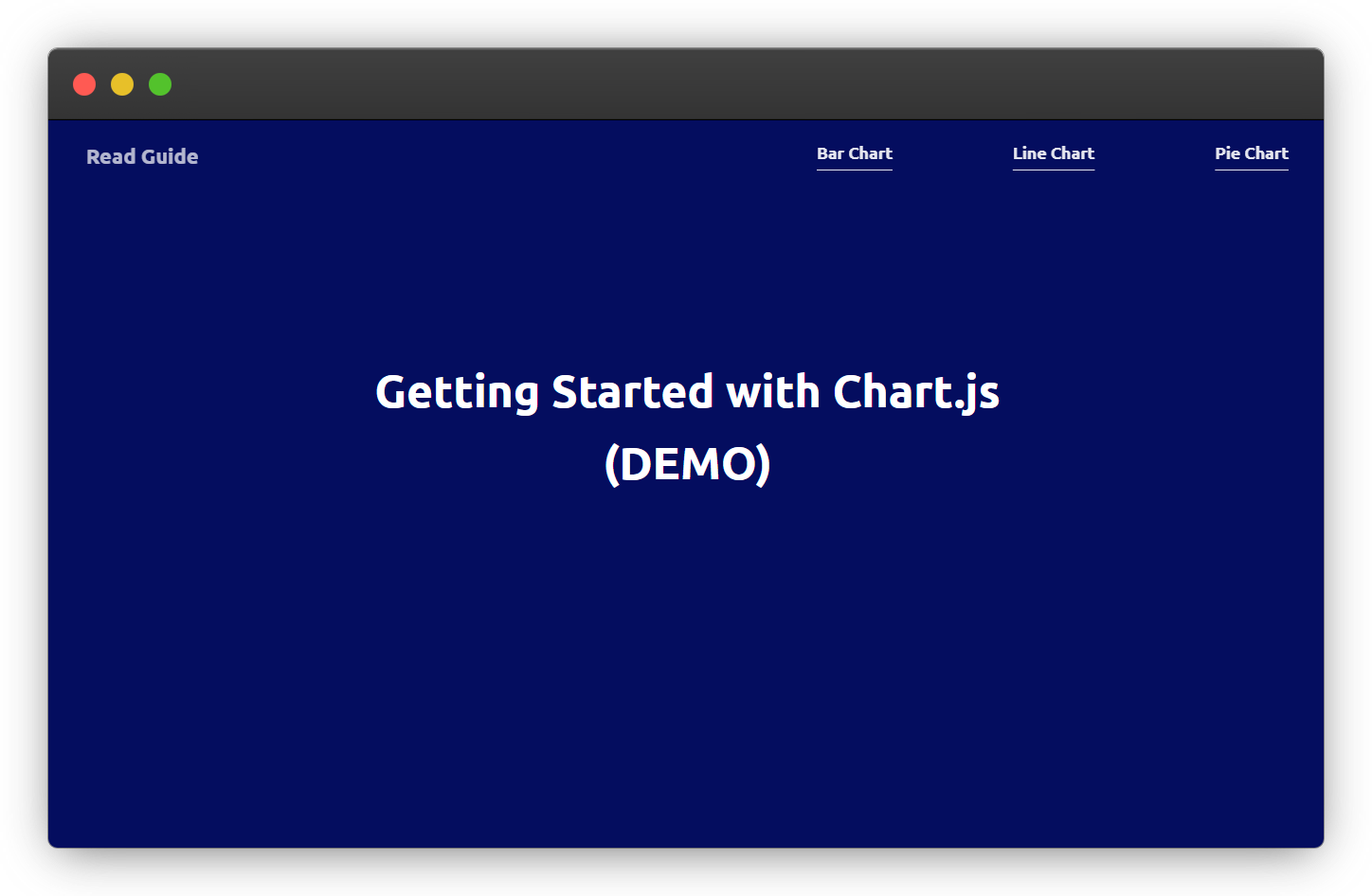
Save your files, and open the chart.html on your browser, your starter template should look something like this.
Building Bar Chart in Chart.js
In this section, we will be creating a visual of the survey result in a bar chart using the concept we've learned from the previous section.
Create a section for the bar chart in the chart.html file as shown below.
<!-- BAR CHART SECTION -->
<section class="chart-section bar-chart" id="bar-chart">
    <h2 class="chart-heading">Bar Chart</h2>
    <div class="chart-wrapper">
        <!-- chart canva -->
        <canvas id="js-bar-chart"></canvas>
    </div>
</section>
Our bar chart should look something like this at the end of this section.
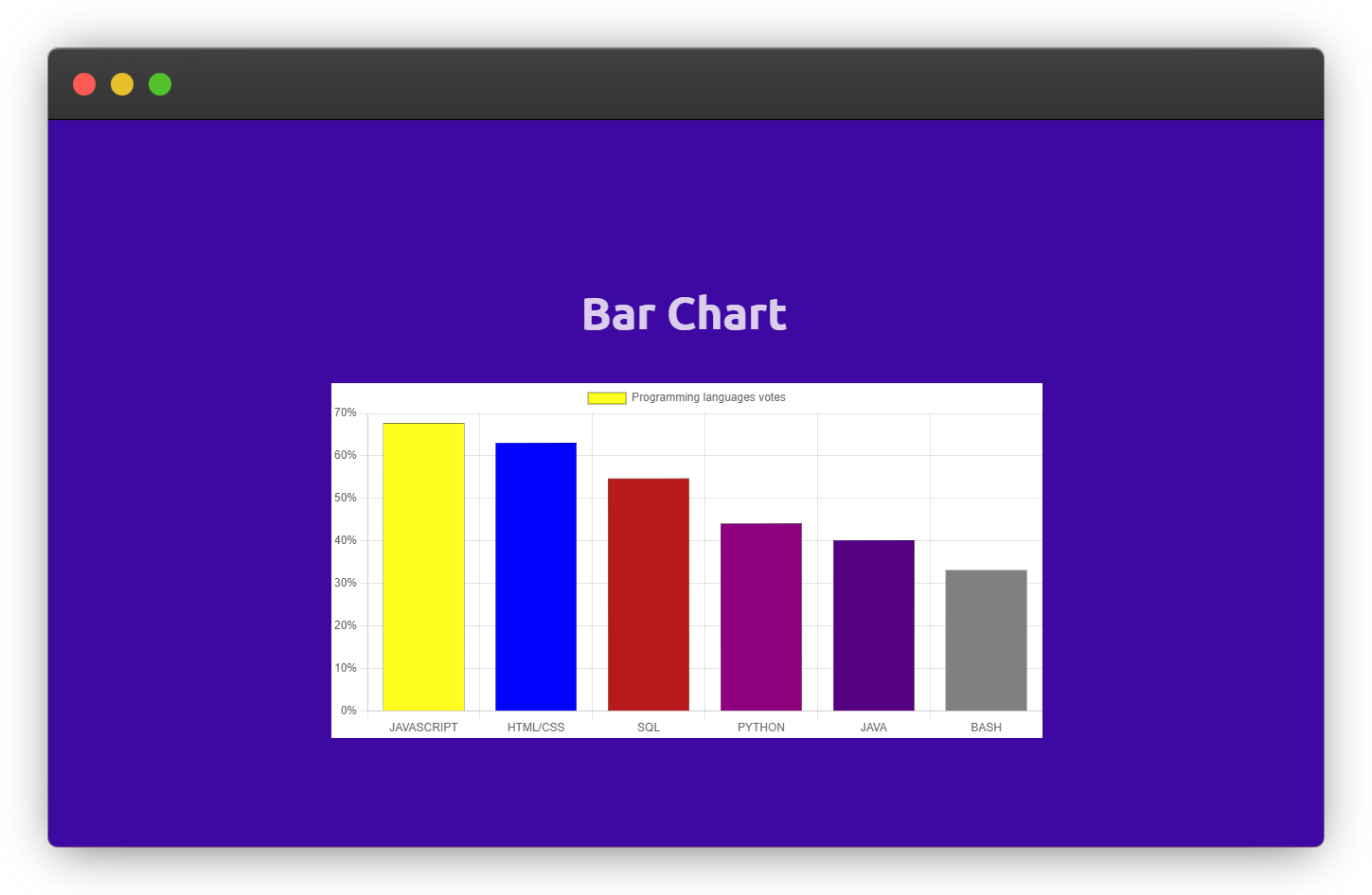
The difference between the above bar chart and the basic bar chart is the different background color of the bars, the dark borders around the bars, the percentage (%) symbol of the data, and the label background color.
The chart.js library allows us to style anything we can see on the chart through the dataset object and not CSS, I will show you how in a bit.
The chart label will take the background color of the first data in the data array, which is the JavaScript yellow in the example given above.
Anything you see, you can style - Anonymous
Another tricky part is adding the percentage (%) symbol to the bar chart data on the vertical labels.
We won't do this, because it won't work.
{
 data: ["67.7%", "63.1%", "54.7%", "44.1%", "40.2%"]
}
Rather, we will be making use of a callback function to add the percentage (%) symbol to each of the data.
Adding Background Color to Chart.js
To add background colors to each of the data been represented on a chart.js chart, pass a backgroundColor property inside of the dataset as shown in bar-chart.js below.
{
  // Chart label horizontal
    labels: ['JAVASCRIPT', 'HTML/CSS', 'SQL', 'PYTHON', 'JAVA'],
    datasets: [
      {
        // Chart label
        label: 'Programming languages votes',
        // Chart data
        data: [67.7, 63.1, 54.7, 44.1, 40.2],
        // Chart data background color
        backgroundColor: [
          'yellow',
          'blue',
          'brown',
          'purple',
          'indigo',
          'gray',
        ],
      },
    ],
},
Ensure to import the bar-chart.js if you're not working with the HTML template.
The arrangement of the backgroundColor array must match the arrangement of the data array and the labels array.
This is what I mean.
JAVASCRIPT -> 67.7 -> yellow
HTML/CSS -> 63.1 -> blue
SQL -> 54.7 -> brown
PYTHON -> 44.1 -> purple
JAVA -> 40.2 -> indigo
And you can add borderWidth and borderColor to your chart like this.
{
    ...

   // Chart border styles
   borderWidth: 0.3,
   borderColor: 'black',
},
Adding Symbols to Chart.js Data
To add any symbol to data in chart.js, we need to define a callback function in the chart configuration option, which is defined as shown below.
 options: {
    scales: {
      y: {
        ticks: {
          callback: function (value) {
            return value + '%';
          },
        },
      },
    },
  },
The y represents the y-axis of the chart which is also the vertical side of the chart, where the chart data is been displayed.
The callback function gives us access to each of the values in the chart data array before they are been rendered to the UI and it returns the new format we define, which is to append the percentage (%) symbol to the data in this case.
I have created a gist here for the complete JavaScript code of the bar chart.
Building Line Chart in Chart.js
In this section, we will visualize the survey data in a line chart.
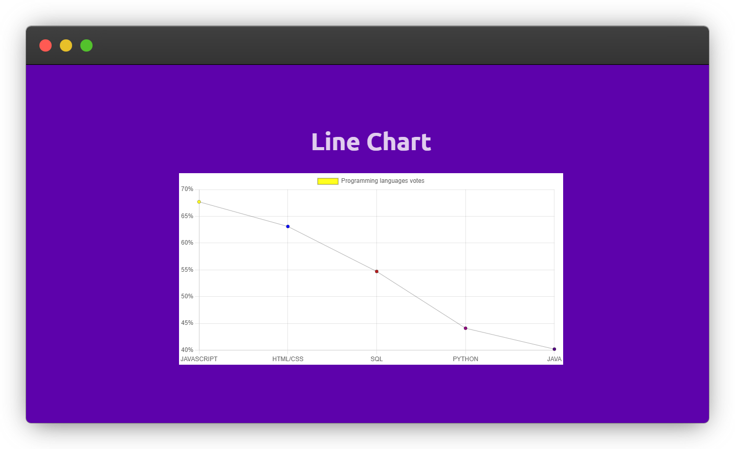
Our final line chart will look like this.
Create a new section for the line chart with a canvas tag, always remember to wrap the canvas tag with a parent element like below.
<!-- LINE CHART SECTION -->
<section class="chart-section line-chart" id="line-chart">
    <h2 class="chart-heading">Line Chart</h2>
    <div class="chart-wrapper">
        <!-- chart canva -->
        <canvas id="js-line-chart"></canvas>
    </div>
</section>
Now, copy and paste the code below into your line-chat.js file.
// Grab the bar chart canva
const lineChartContext = document
  .getElementById('js-line-chart')
  .getContext('2d');

// Creating a new chart instance
const newLineChart = new Chart(lineChartContext, {
  // Chart configuration
  type: 'line',
  data: {
    // Chart Label Vertical
    labels: ['JAVASCRIPT', 'HTML/CSS', 'SQL', 'PYTHON', 'JAVA'],
    datasets: [
      {
        // Chart lable
        label: 'Programming languages votes',
        // Chart data
        data: [67.7, 63.1, 54.7, 44.1, 40.2],
        // Chart data background color
        backgroundColor: ['yellow', 'blue', 'brown', 'purple', 'indigo'],
        // Chart border styles
        borderWidth: 0.3,
        borderColor: 'black',
      },
    ],
  },
  options: {
    responsive: true,
    scales: {
      y: {
        ticks: {
          callback: function (value) {
            return value + '%';
          },
        },
      },
    },
  },
});
The only differences between the code in bar-chart.js and the code in line-chart.js are the variable name and the chart type.
You should be more familiar with the code structure of the charts by now.
Building a Pie Chart in Chart.js
Finally in this section, we'll represent the survey result in a pie chart.
Create a new section for the pie chart in your html document like this.
<!-- PIE CHART SECTION -->
<section class="chart-section pie-chart" id="pie-chart">
    <h2 class="chart-heading">Pie Chart</h2>
    <div class="chart-wrapper">
        <!-- chart canva -->
        <canvas id="js-pie-chart"></canvas>
    </div>
</section>
Now Create a pie-chart.js file and copy-paste the code below.
// Grab the bar chart canva
const pieChartContext = document
  .getElementById('js-pie-chart')
  .getContext('2d');

// Creating a new chart instance
const newPieChart = new Chart(pieChartContext, {
  // Chart configuration
  type: 'pie',
  data: {
    // Chart Label Vertical
    labels: ['JAVASCRIPT', 'HTML/CSS', 'SQL', 'PYTHON', 'JAVA'],
    datasets: [
      {
        // Chart data
        data: [67.7, 63.1, 54.7, 44.1, 40.2],
        label: 'Programming languages votes',
        backgroundColor: ['yellow', 'blue', 'brown', 'purple', 'indigo'],
        borderWidth: 0.3,
        borderColor: 'black',
      },
    ],
  },
  options: {
    responsive: true,
    // Maintain the original canvas aspect ratio (width / height) when resizing.
    maintainAspectRatio: false,
  },
});
The code for the pie chart above is pretty much the same as the bar chart, and line chart implementation.
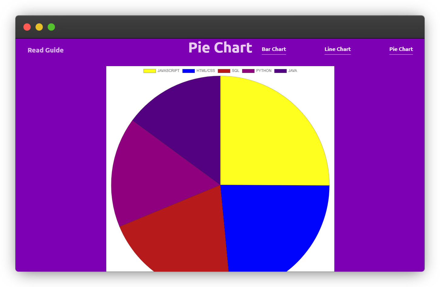
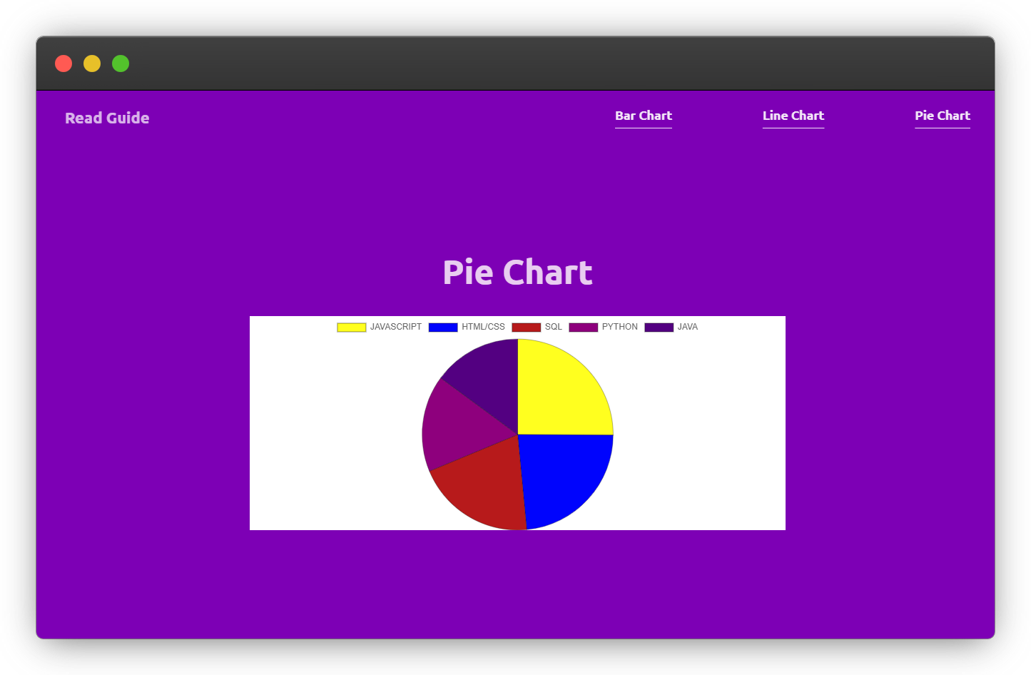
But the pie chart needs extra help to become fully responsive across all screen sizes, so we need to set the maintainAspectRatio to false in the configuration option to make it responsive across all screen sizes.
Without maintainAspectRatio property
With maintainAspectRatio set to false
Conclusion
Data presentation is an important element to have in a frontend application, and in this post, you learned how to use the chart.js library to create a bar chart, a line chart, and a pie chart.
With the knowledge gained from this post, you can use chart.js to work with more complex data.
Reference
If you are interested in learning more about charts, the resource below will help you to take data visualization with charts to the next level.
Wow, what a journey, I am glad you made it to the end of this article, if you enjoyed and learned something new from this article, I will like to connect with you.
Let's connect on
See you in the next article. Bye Bye 🙋♂️

If you found my content helpful and want to support my blog, you can also buy me a coffee below, my blog lives on coffee 🙏.
Enjoyed this article?
Subscribe to my YouTube channel for coding tutorials, live project builds, and tech discussions.
Subscribe