Learn How to Use Tailwind Spinner Effectively: A Detailed Guide
2 years ago
11 mins readThe loader is a vital component that a reactive website should have. It keeps the user informed about when something is being processed and when it has completed.
Loaders indicate that an action is in progress and then hide once the action completes, signalling success or failure in the action as demonstrated below.
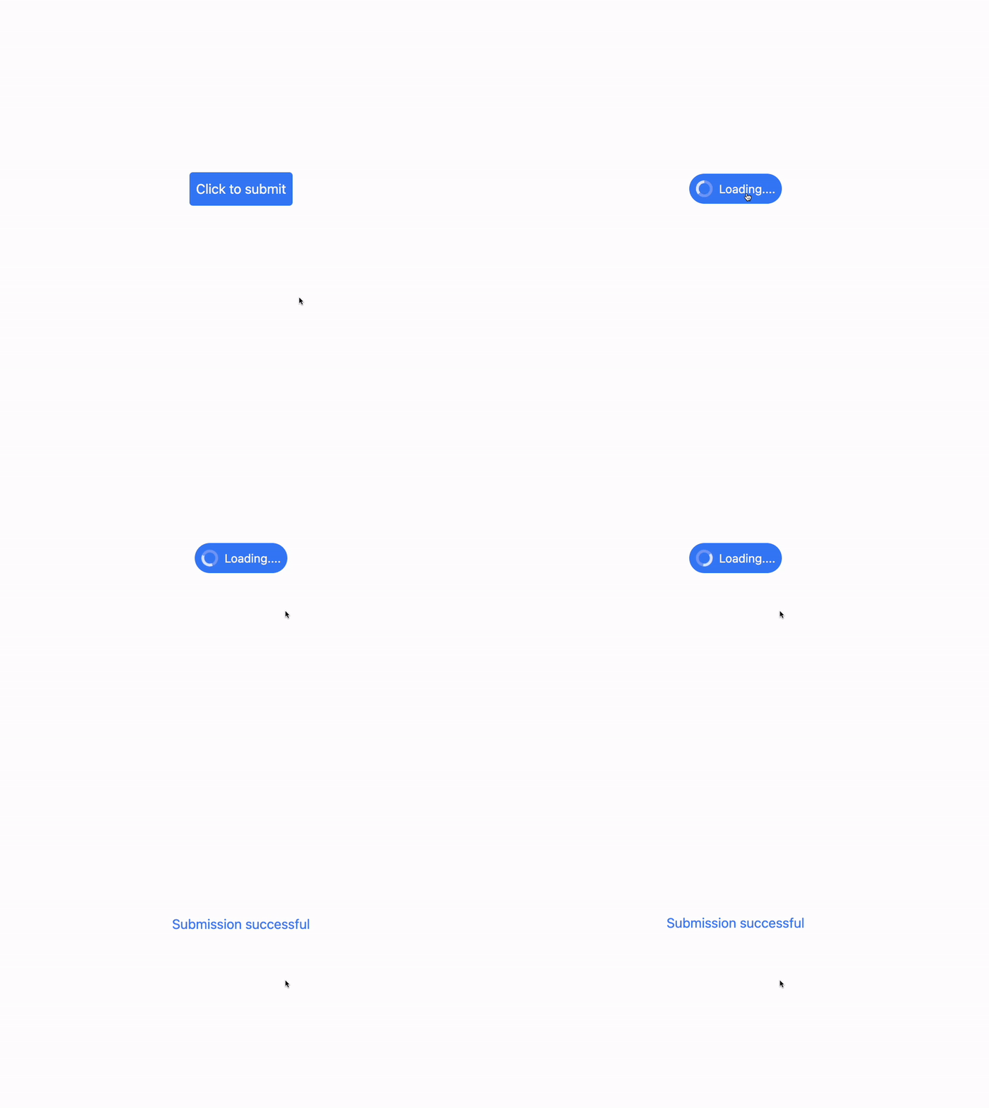
Source code:
<!DOCTYPE html>
<html>
  <head>
    <meta charset="UTF-8" />
    <meta name="viewport" content="width=device-width, initial-scale=1.0" />
    <script src="https://cdn.tailwindcss.com"></script>

    <script>
      function handleClick() {
        const submitButton = document.querySelector("#submit-btn");
        const loadingButton = document.querySelector("#loading-btn");
        const messageTag = document.querySelector("#message");

        submitButton.classList.add("hidden");
        loadingButton.classList.remove("hidden");

        setTimeout(() => {
          loadingButton.classList.add("hidden");
          messageTag.classList.remove("hidden");
          messageTag.innerHTML = "Submission successful ";
        }, 4000);
      }
    </script>
  </head>
  <body class="flex justify-center items-center h-screen">
    <p id="message" class="hidden animate-bounce text-blue-500"></p>
    <button
      id="submit-btn"
      class="bg-blue-500 rounded p-2 text-white"
      onclick="handleClick()"
    >
      Click to submit
    </button>
    <button
      id="loading-btn"
      class="hidden bg-blue-500 rounded-full flex items-center p-2 text-white gap-2"
    >
      <svg
        class="animate-spin h-5 w-5"
        xmlns="http://www.w3.org/2000/svg"
        fill="none"
        viewBox="0 0 24 24"
      >
        <circle
          class="opacity-25"
          cx="12"
          cy="12"
          r="10"
          stroke="currentColor"
          stroke-width="4"
        ></circle>
        <path
          class="opacity-75"
          fill="currentColor"
          d="M4 12a8 8 0 018-8V0C5.373 0 0 5.373 0 12h4zm2 5.291A7.962 7.962 0 014 12H0c0 3.042 1.135 5.824 3 7.938l3-2.647z"
        ></path>
      </svg>
      <span class="text-sm"> Loading.... </span>
    </button>
  </body>
</html>
In this comprehensive article, we will delve into the process of creating a visually appealing and functional loading spinner component by leveraging the powerful animation utility classes provided by the popular Tailwind CSS framework.
This will enable us to enhance the user experience of our web applications by displaying a captivating loading indicator while the content is being fetched or processed.
How Animation Works in Tailwind CSS
Animation is achieved in Tailwind CSS through the animate utility class. The animation utility classes include different animations such as spin, ping, pulse, and bounce animations.
Tailwind Animation Utility Classes
Below, you'll find detailed usage instructions and examples for the four primary Tailwind animation utility classes:
Animate Spin
animate-spin
The spin animation, for instance, creates a smooth, continuous rotation effect, which is ideal for crafting loading spinners that visually communicate to users that an action is currently being processed.
Example:

Source code:
<!DOCTYPE html>
<html>
  <head>
    <meta charset="UTF-8" />
    <meta name="viewport" content="width=device-width, initial-scale=1.0" />
    <script src="https://cdn.tailwindcss.com"></script>
  </head>
  <body class="flex justify-center items-center h-screen">
    <h1 class="text-3xl font-bold underline animate-spin">Hello world!</h1>
  </body>
</html>
Animate Ping
animate-ping
The animate-ping animation utility generates a combination of scale and fade effects, which is particularly beneficial for signaling notifications or drawing attention to specific elements within a user interface.
Example:

By utilizing this animation, developers can enhance the user experience by providing subtle visual cues to guide user interactions and emphasize important updates or alerts.
Source code:
<!DOCTYPE html>
<html>
  <head>
    <meta charset="UTF-8" />
    <meta name="viewport" content="width=device-width, initial-scale=1.0" />
    <script src="https://cdn.tailwindcss.com"></script>
  </head>
  <body class="flex justify-center items-center h-screen">
    <h1 class="text-3xl font-bold underline animate-ping">Hello world!</h1>
  </body>
</html>
Animate Pulse
animate-pulse
The animate-pulse utility class generates a subtle and smooth fade-in and out effect, making it an ideal choice for designing component skeleton loaders.
Example:

This effect can enhance user experience by providing visual feedback while content is being loaded.
Source code:
<!DOCTYPE html>
<html>
  <head>
    <meta charset="UTF-8" />
    <meta name="viewport" content="width=device-width, initial-scale=1.0" />
    <script src="https://cdn.tailwindcss.com"></script>
  </head>
  <body class="flex justify-center items-center h-screen">
    <h1 class="text-3xl font-bold underline animate-pulse">Hello world!</h1>
  </body>
</html>
Animate Bounce
animate-bounce
The animate-bounce class is a utility class in Tailwind CSS that creates a visually appealing bouncing effect to the applied element. When this class is used, the element continuously moves up and down, giving the impression of a bouncing motion.
Example:
The effect can be observed and better understood through the following example:

Source code:
<!DOCTYPE html>
<html>
  <head>
    <meta charset="UTF-8" />
    <meta name="viewport" content="width=device-width, initial-scale=1.0" />
    <script src="https://cdn.tailwindcss.com"></script>
  </head>
  <body class="flex justify-center items-center h-screen">
    <h1 class="text-3xl font-bold underline animate-bounce">Hello world!</h1>
  </body>
</html>
Customizing Loading Spinners in Tailwind CSS
To create a spinner loader, we'll apply the Tailwind spin animation utility class on an SVG or circular element for example as shown below.
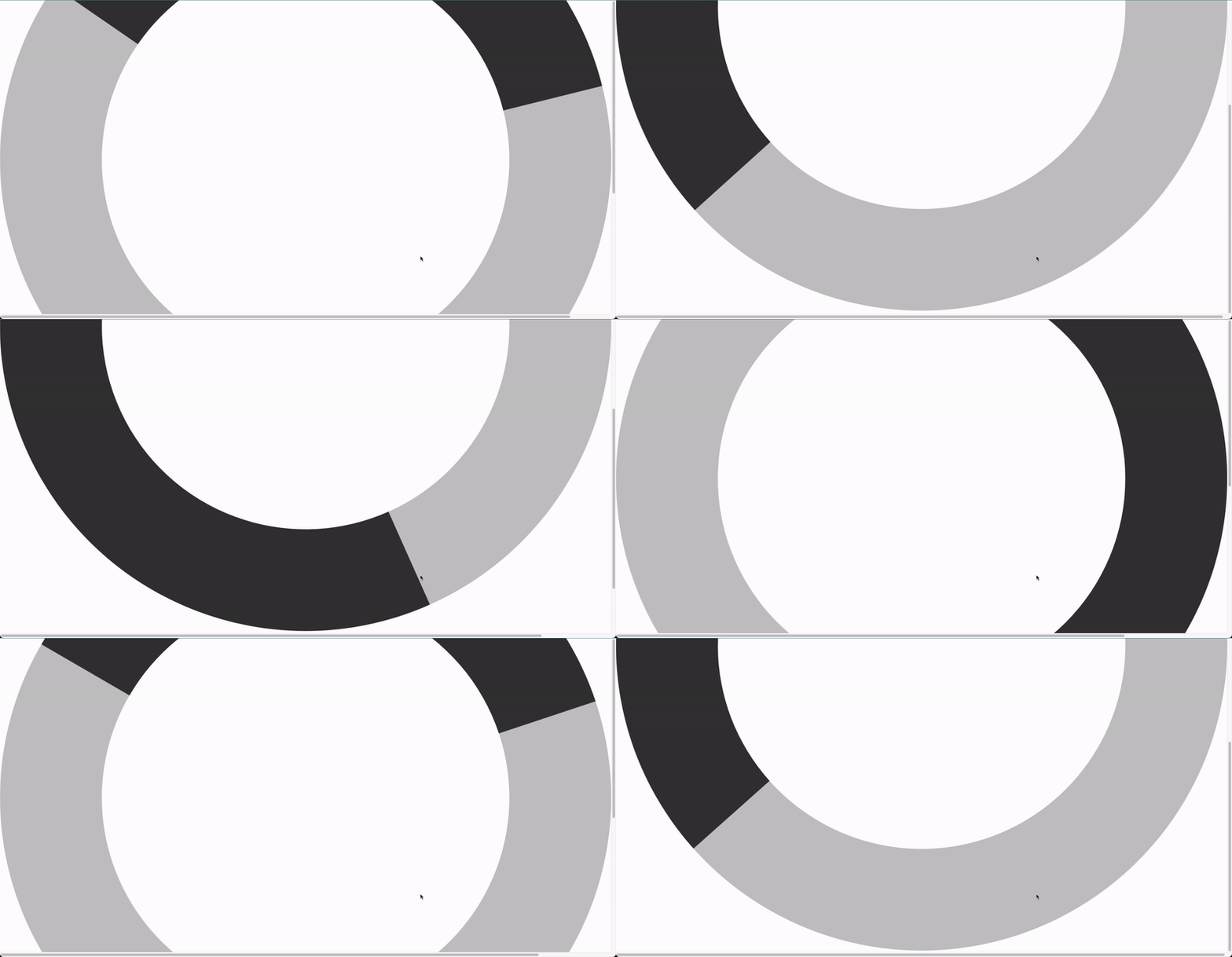
Here's the source code of the above demonstration:
<!DOCTYPE html>
<html>
  <head>
    <meta charset="UTF-8" />
    <meta name="viewport" content="width=device-width, initial-scale=1.0" />
    <script src="https://cdn.tailwindcss.com"></script>
  </head>
  <body class="flex justify-center items-center h-screen">
    <svg
      class="animate-spin"
      xmlns="http://www.w3.org/2000/svg"
      fill="none"
      viewBox="0 0 24 24"
    >
      <circle
        class="opacity-25"
        cx="12"
        cy="12"
        r="10"
        stroke="currentColor"
        stroke-width="4"
      ></circle>
      <path
        class="opacity-75"
        fill="currentColor"
        d="M4 12a8 8 0 018-8V0C5.373 0 0 5.373 0 12h4zm2 5.291A7.962 7.962 0 014 12H0c0 3.042 1.135 5.824 3 7.938l3-2.647z"
      ></path>
    </svg>
  </body>
</html>
Unleash the power of Purecode AI assistant to generate countless responsive custom-designed HTML, CSS, Tailwind, and JS components, all adaptable to your brand.
Customizing Loading Spinner Sizes in Tailwind CSS
To customize the size of a loading spinner, we can adjust the height and width using their regular Tailwind utility classes.
For example, the spinner below has a height and width of 20px:

The source code:
<!DOCTYPE html>
<html>
  <head>
    <meta charset="UTF-8" />
    <meta name="viewport" content="width=device-width, initial-scale=1.0" />
    <script src="https://cdn.tailwindcss.com"></script>
  </head>
  <body class="flex justify-center items-center h-screen">
    <svg
      class="animate-spin h-5 w-5"
      xmlns="http://www.w3.org/2000/svg"
      fill="none"
      viewBox="0 0 24 24"
    >
      <circle
        class="opacity-25"
        cx="12"
        cy="12"
        r="10"
        stroke="currentColor"
        stroke-width="4"
      ></circle>
      <path
        class="opacity-75"
        fill="currentColor"
        d="M4 12a8 8 0 018-8V0C5.373 0 0 5.373 0 12h4zm2 5.291A7.962 7.962 0 014 12H0c0 3.042 1.135 5.824 3 7.938l3-2.647z"
      ></path>
    </svg>
  </body>
</html>
Customizing Loading Spinner Colors in Tailwind CSS
To customize the color of a loading spinner, we can apply the regular Tailwind text color palette utility classes as shown below.
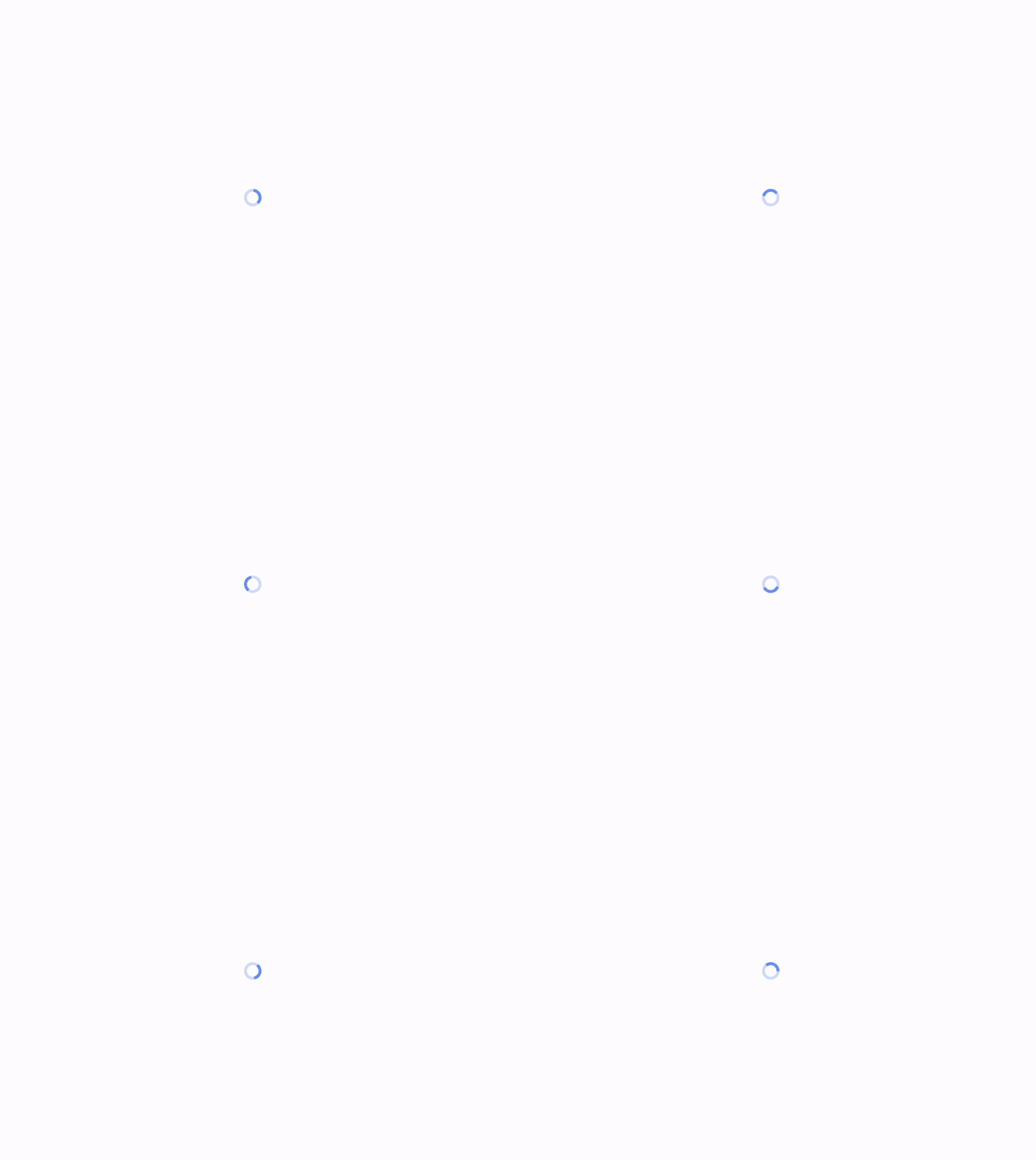
Source code:
<!DOCTYPE html>
<html>
  <head>
    <meta charset="UTF-8" />
    <meta name="viewport" content="width=device-width, initial-scale=1.0" />
    <script src="https://cdn.tailwindcss.com"></script>
  </head>
  <body class="flex justify-center items-center h-screen">
    <svg
      class="animate-spin h-5 w-5 text-blue-500"
      xmlns="http://www.w3.org/2000/svg"
      fill="none"
      viewBox="0 0 24 24"
    >
      <circle
        class="opacity-25"
        cx="12"
        cy="12"
        r="10"
        stroke="currentColor"
        stroke-width="4"
      ></circle>
      <path
        class="opacity-75"
        fill="currentColor"
        d="M4 12a8 8 0 018-8V0C5.373 0 0 5.373 0 12h4zm2 5.291A7.962 7.962 0 014 12H0c0 3.042 1.135 5.824 3 7.938l3-2.647z"
      ></path>
    </svg>
  </body>
</html>
Customizing Loading Spinner Positioning in Tailwind CSS
Loading spinners can be positioned in a specific section of the page, particularly when used as a full-page loader.
Below are examples and source code illustrating how to position a page-loading spinner.
Top
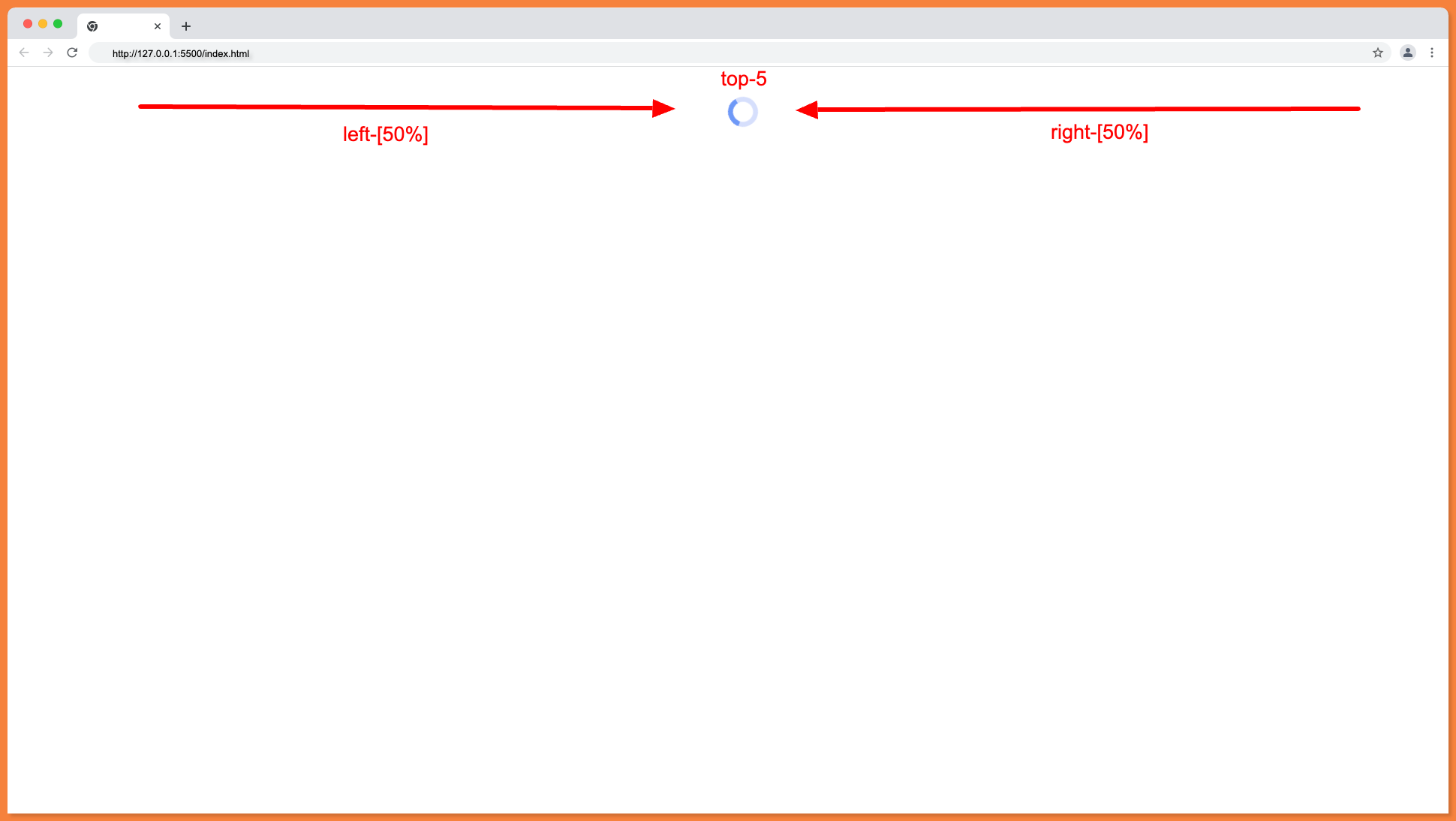
To position a spinner at the top center of the page, apply the absolute position property to enable moving it around. Then, apply right-[50%], left-[50%], and an optional top-5 to create space from the top.
The properties mentioned above will position the loading spinner as follows: at the top center of the page, with an optional space from the top.
Source code:
<!DOCTYPE html>
<html>
  <head>
    <meta charset="UTF-8" />
    <meta name="viewport" content="width=device-width, initial-scale=1.0" />
    <script src="https://cdn.tailwindcss.com"></script>
  </head>
  <body>
    <svg
      class="animate-spin h-5 w-5 text-blue-500 absolute right-[50%] left-[50%] top-5"
      xmlns="http://www.w3.org/2000/svg"
      fill="none"
      viewBox="0 0 24 24"
    >
      <circle
        class="opacity-25"
        cx="12"
        cy="12"
        r="10"
        stroke="currentColor"
        stroke-width="4"
      ></circle>
      <path
        class="opacity-75"
        fill="currentColor"
        d="M4 12a8 8 0 018-8V0C5.373 0 0 5.373 0 12h4zm2 5.291A7.962 7.962 0 014 12H0c0 3.042 1.135 5.824 3 7.938l3-2.647z"
      ></path>
    </svg>
  </body>
</html>
Top Left
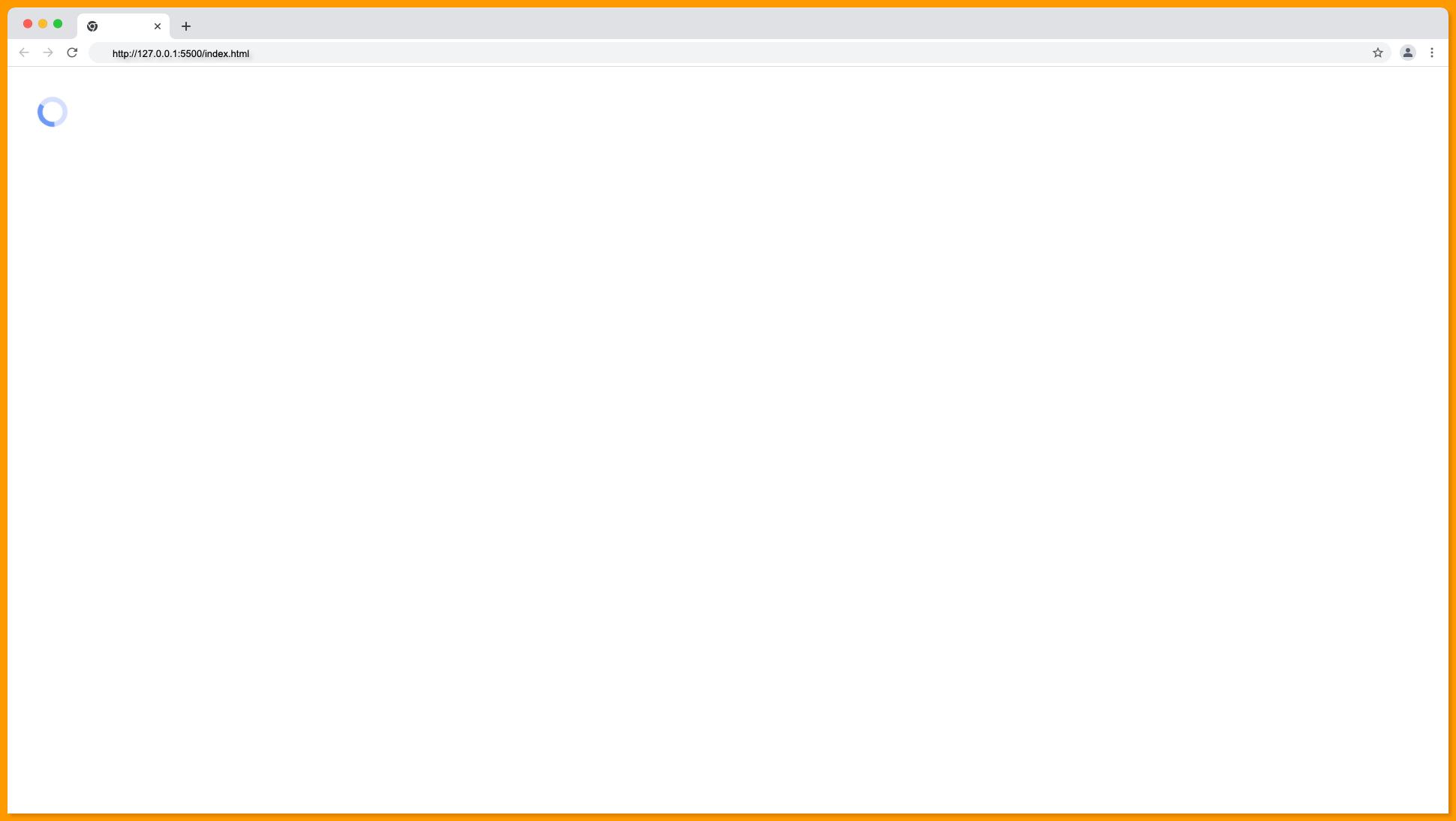
This is the default position of an absolute element. You can adjust the position of a page loader to the left by using the absolute position and left property, as demonstrated below.
Source code:
<!DOCTYPE html>
<html>
  <head>
    <meta charset="UTF-8" />
    <meta name="viewport" content="width=device-width, initial-scale=1.0" />
    <script src="https://cdn.tailwindcss.com"></script>
  </head>
  <body>
    <svg
      class="animate-spin h-5 w-5 text-blue-500 absolute top-5 left-5"
      xmlns="http://www.w3.org/2000/svg"
      fill="none"
      viewBox="0 0 24 24"
    >
      <circle
        class="opacity-25"
        cx="12"
        cy="12"
        r="10"
        stroke="currentColor"
        stroke-width="4"
      ></circle>
      <path
        class="opacity-75"
        fill="currentColor"
        d="M4 12a8 8 0 018-8V0C5.373 0 0 5.373 0 12h4zm2 5.291A7.962 7.962 0 014 12H0c0 3.042 1.135 5.824 3 7.938l3-2.647z"
      ></path>
    </svg>
  </body>
</html>
Top Right
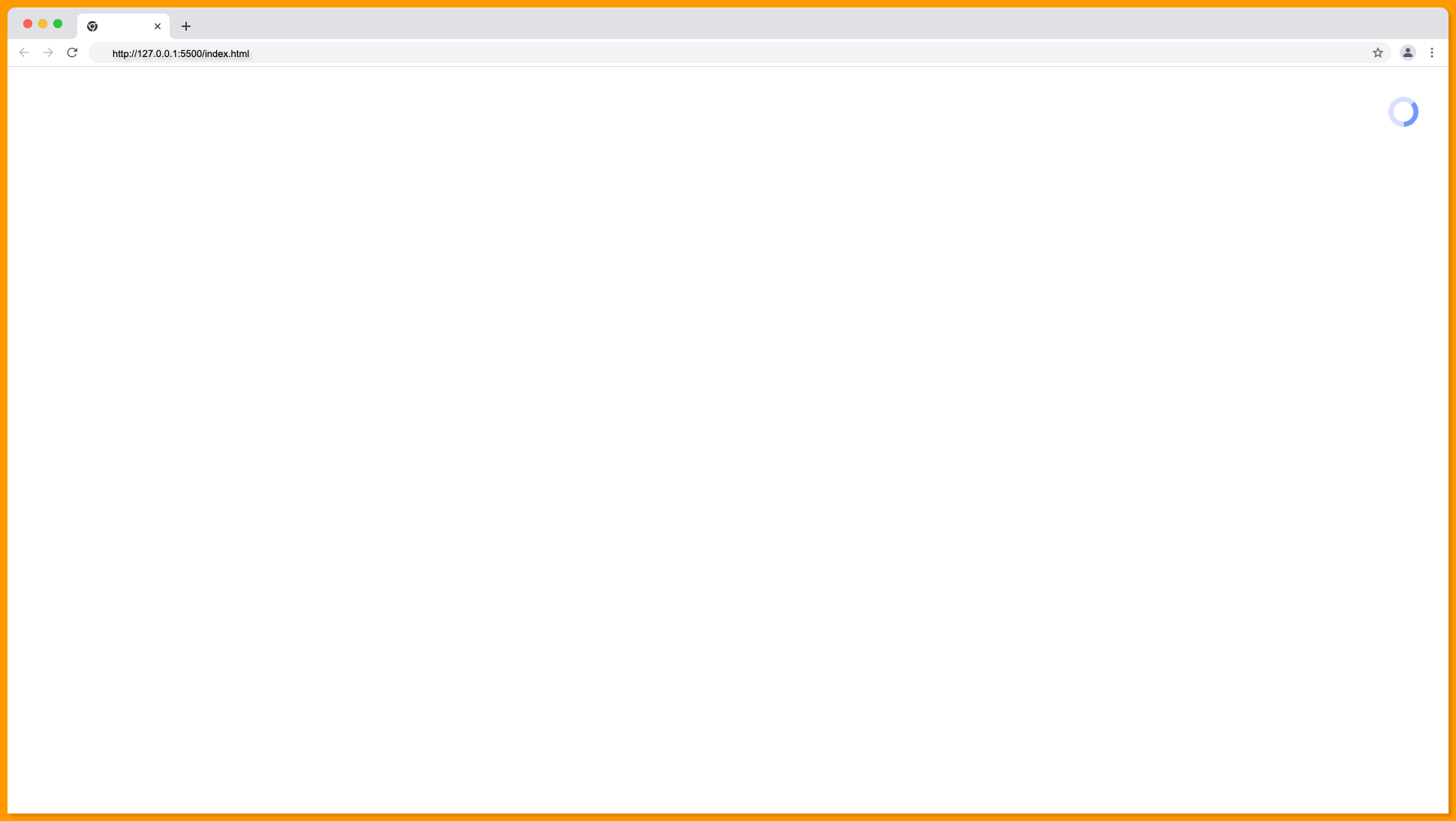
Apply the absolute and right properties to the spinner loader to position it at the top right of the page, as demonstrated below.
Source code:
<!DOCTYPE html>
<html>
  <head>
    <meta charset="UTF-8" />
    <meta name="viewport" content="width=device-width, initial-scale=1.0" />
    <script src="https://cdn.tailwindcss.com"></script>
  </head>
  <body>
    <svg
      class="animate-spin h-5 w-5 text-blue-500 absolute top-5 right-5"
      xmlns="http://www.w3.org/2000/svg"
      fill="none"
      viewBox="0 0 24 24"
    >
      <circle
        class="opacity-25"
        cx="12"
        cy="12"
        r="10"
        stroke="currentColor"
        stroke-width="4"
      ></circle>
      <path
        class="opacity-75"
        fill="currentColor"
        d="M4 12a8 8 0 018-8V0C5.373 0 0 5.373 0 12h4zm2 5.291A7.962 7.962 0 014 12H0c0 3.042 1.135 5.824 3 7.938l3-2.647z"
      ></path>
    </svg>
  </body>
</html>
Bottom
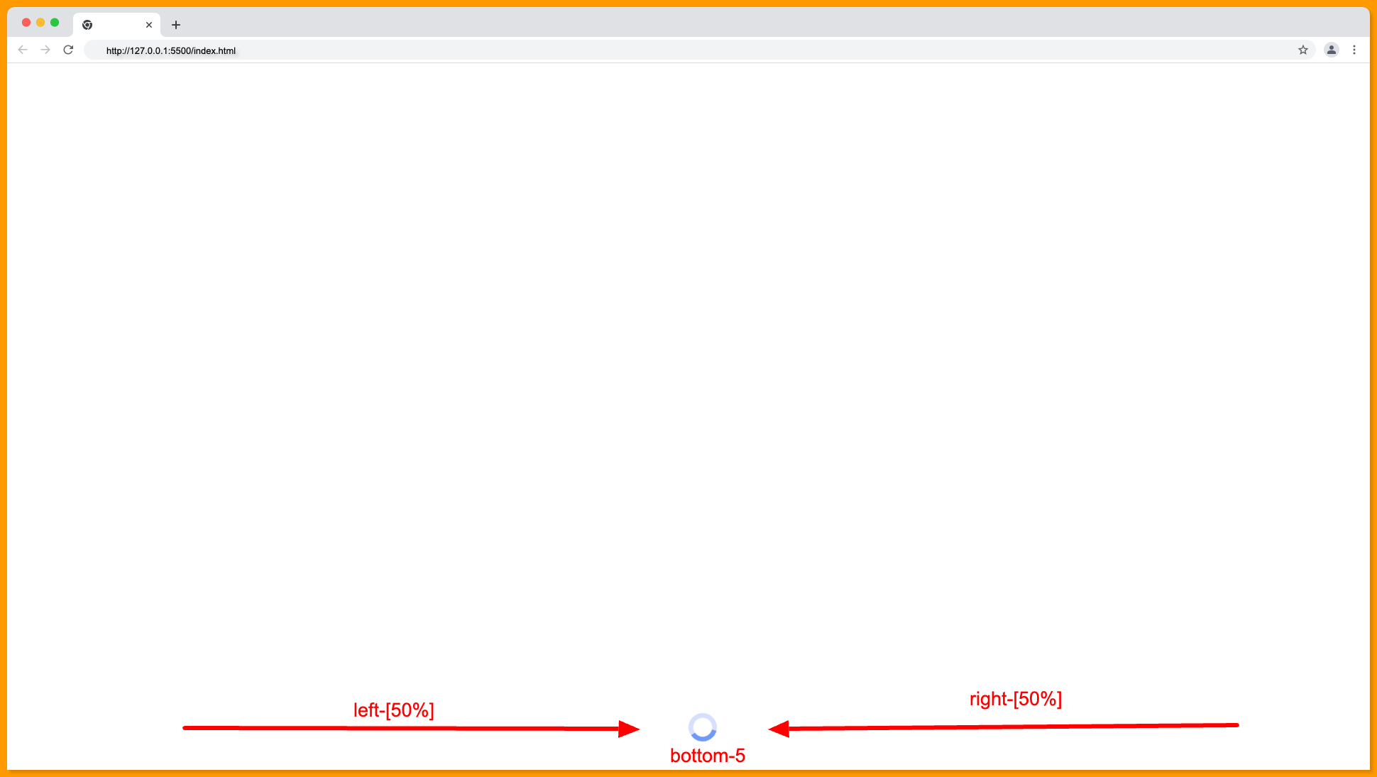
To position a spinner at the top center of the page, apply the absolute position property to enable moving it around. Then, apply right-[50%], left-[50%], and an optional bottom-5 to create space from the top.
The properties mentioned above will position the loading spinner as follows: at the bottom center of the page.
Source code:
<!DOCTYPE html>
<html>
  <head>
    <meta charset="UTF-8" />
    <meta name="viewport" content="width=device-width, initial-scale=1.0" />
    <script src="https://cdn.tailwindcss.com"></script>
  </head>
  <body>
    <svg
      class="animate-spin h-5 w-5 text-blue-500 absolute right-[50%] left-[50%] bottom-5"
      xmlns="http://www.w3.org/2000/svg"
      fill="none"
      viewBox="0 0 24 24"
    >
      <circle
        class="opacity-25"
        cx="12"
        cy="12"
        r="10"
        stroke="currentColor"
        stroke-width="4"
      ></circle>
      <path
        class="opacity-75"
        fill="currentColor"
        d="M4 12a8 8 0 018-8V0C5.373 0 0 5.373 0 12h4zm2 5.291A7.962 7.962 0 014 12H0c0 3.042 1.135 5.824 3 7.938l3-2.647z"
      ></path>
    </svg>
  </body>
</html>
Bottom Left
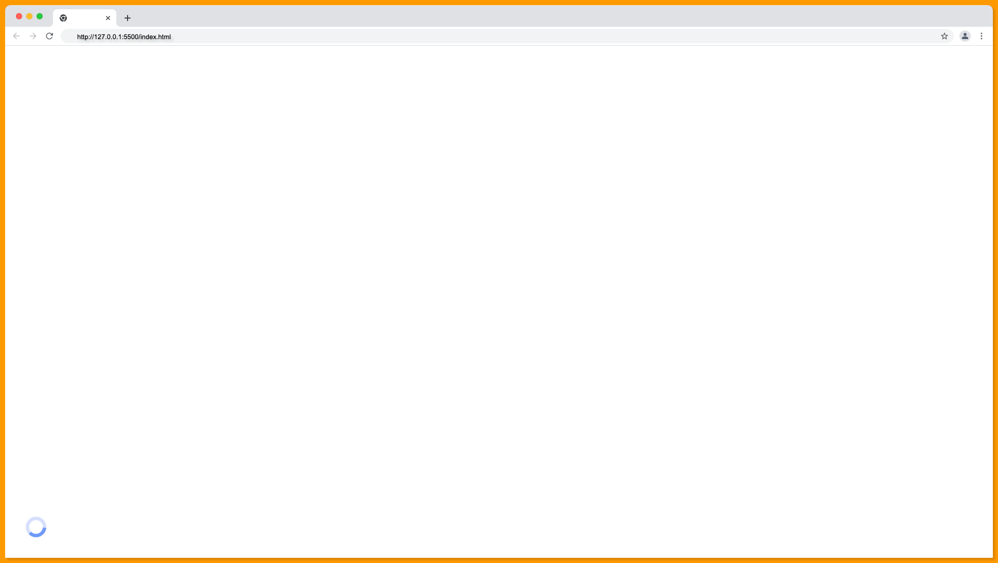
Apply the absolute, bottom, and left properties to the spinner loader to position it at the bottom left of the page, as demonstrated below.
Source code:
<!DOCTYPE html>
<html>
  <head>
    <meta charset="UTF-8" />
    <meta name="viewport" content="width=device-width, initial-scale=1.0" />
    <script src="https://cdn.tailwindcss.com"></script>
  </head>
  <body>
    <svg
      class="animate-spin h-5 w-5 text-blue-500 absolute bottom-5 left-5"
      xmlns="http://www.w3.org/2000/svg"
      fill="none"
      viewBox="0 0 24 24"
    >
      <circle
        class="opacity-25"
        cx="12"
        cy="12"
        r="10"
        stroke="currentColor"
        stroke-width="4"
      ></circle>
      <path
        class="opacity-75"
        fill="currentColor"
        d="M4 12a8 8 0 018-8V0C5.373 0 0 5.373 0 12h4zm2 5.291A7.962 7.962 0 014 12H0c0 3.042 1.135 5.824 3 7.938l3-2.647z"
      ></path>
    </svg>
  </body>
</html>
Bottom Right
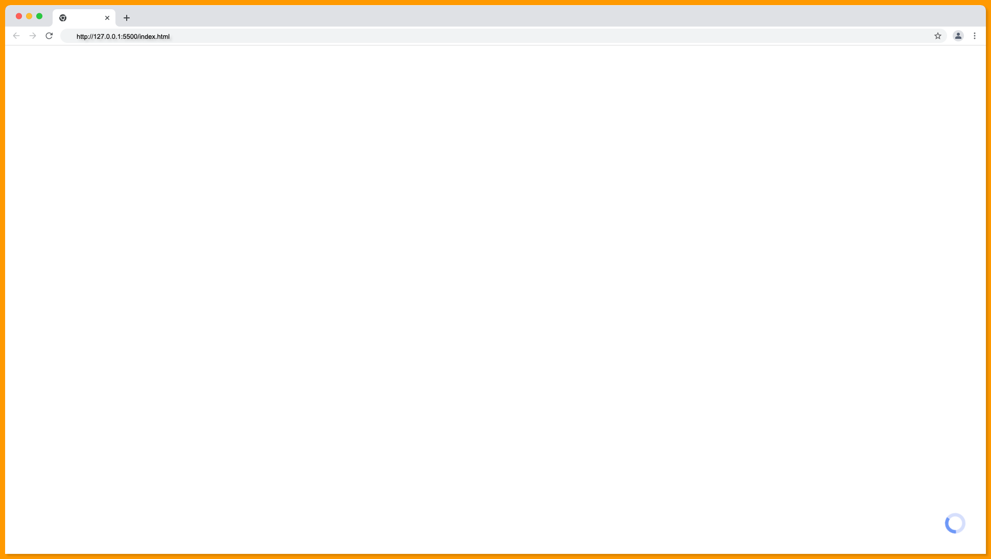
Apply the absolute, bottom, and right properties to the spinner loader to position it at the bottom right of the page, as demonstrated below.
Source code:
<!DOCTYPE html>
<html>
  <head>
    <meta charset="UTF-8" />
    <meta name="viewport" content="width=device-width, initial-scale=1.0" />
    <script src="https://cdn.tailwindcss.com"></script>
  </head>
  <body>
    <svg
      class="animate-spin h-5 w-5 text-blue-500 absolute bottom-5 right-5"
      xmlns="http://www.w3.org/2000/svg"
      fill="none"
      viewBox="0 0 24 24"
    >
      <circle
        class="opacity-25"
        cx="12"
        cy="12"
        r="10"
        stroke="currentColor"
        stroke-width="4"
      ></circle>
      <path
        class="opacity-75"
        fill="currentColor"
        d="M4 12a8 8 0 018-8V0C5.373 0 0 5.373 0 12h4zm2 5.291A7.962 7.962 0 014 12H0c0 3.042 1.135 5.824 3 7.938l3-2.647z"
      ></path>
    </svg>
  </body>
</html>
Loading on Hover
To apply the spinning effect when the mouse hovers over an element, you can use the Tailwind hover pseudo-class.
Below is a demonstration of a loading spinner on hover in Tailwind CSS.

Source code:
<!DOCTYPE html>
<html>
  <head>
    <meta charset="UTF-8" />
    <meta name="viewport" content="width=device-width, initial-scale=1.0" />
    <script src="https://cdn.tailwindcss.com"></script>
  </head>
  <body class="flex justify-center items-center h-screen">
    <svg
      class="hover:animate-spin hover:text-red-500 cursor-pointer h-5 w-5 text-blue-500"
      xmlns="http://www.w3.org/2000/svg"
      fill="none"
      viewBox="0 0 24 24"
    >
      <circle
        class="opacity-25"
        cx="12"
        cy="12"
        r="10"
        stroke="currentColor"
        stroke-width="4"
      ></circle>
      <path
        class="opacity-75"
        fill="currentColor"
        d="M4 12a8 8 0 018-8V0C5.373 0 0 5.373 0 12h4zm2 5.291A7.962 7.962 0 014 12H0c0 3.042 1.135 5.824 3 7.938l3-2.647z"
      ></path>
    </svg>
  </body>
</html>
Loading on Focus
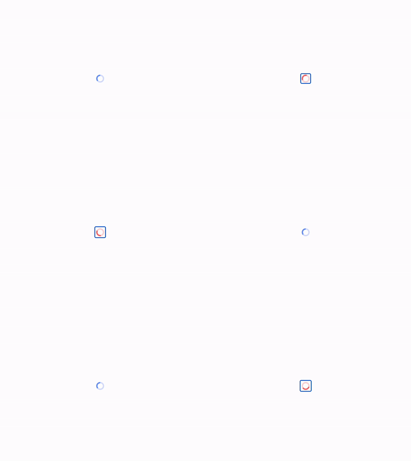
To apply the spinning effect when the spinner is focused, wrap the spinner in a button element and utilize the Tailwind CSS group utility classes to achieve the desired effect. See the demo below:
Source code:
<!DOCTYPE html>
<html>
  <head>
    <meta charset="UTF-8" />
    <meta name="viewport" content="width=device-width, initial-scale=1.0" />
    <script src="https://cdn.tailwindcss.com"></script>
  </head>
  <body class="flex justify-center items-center h-screen">
    <button class="group">
      <svg
        class="group-focus:animate-spin group-focus:text-red-500 cursor-pointer h-5 w-5 text-blue-500"
        xmlns="http://www.w3.org/2000/svg"
        fill="none"
        viewBox="0 0 24 24"
      >
        <circle
          class="opacity-25"
          cx="12"
          cy="12"
          r="10"
          stroke="currentColor"
          stroke-width="4"
        ></circle>
        <path
          class="opacity-75"
          fill="currentColor"
          d="M4 12a8 8 0 018-8V0C5.373 0 0 5.373 0 12h4zm2 5.291A7.962 7.962 0 014 12H0c0 3.042 1.135 5.824 3 7.938l3-2.647z"
        ></path>
      </svg>
    </button>
  </body>
</html>
You can learn more about using the group property to style an element based on its parent state in Tailwind CSS from this guide.
Tailwind CSS Spinner / Loader - Free Examples & Tutorial
Showing Loader in a Button
This refers to the process of displaying a spinner or loader animation within a button, typically used to indicate that an action is in progress.

Source code:
<!DOCTYPE html>
<html>
  <head>
    <meta charset="UTF-8" />
    <meta name="viewport" content="width=device-width, initial-scale=1.0" />
    <script src="https://cdn.tailwindcss.com"></script>
  </head>
  <body class="flex justify-center items-center h-screen">
    <button
      class="bg-blue-500 rounded-full flex items-center p-2 text-white gap-2"
    >
      <svg
        class="animate-spin h-5 w-5"
        xmlns="http://www.w3.org/2000/svg"
        fill="none"
        viewBox="0 0 24 24"
      >
        <circle
          class="opacity-25"
          cx="12"
          cy="12"
          r="10"
          stroke="currentColor"
          stroke-width="4"
        ></circle>
        <path
          class="opacity-75"
          fill="currentColor"
          d="M4 12a8 8 0 018-8V0C5.373 0 0 5.373 0 12h4zm2 5.291A7.962 7.962 0 014 12H0c0 3.042 1.135 5.824 3 7.938l3-2.647z"
        ></path>
      </svg>
      <span class="text-sm"> Loading.... </span>
    </button>
  </body>
</html>
Tailwind Animation Utility Classes
| Type | Utility class | Description |
| Spin | animate-spin | A linear spin animation to elements like loading indicators. |
| Ping | animate-ping | To make an element scale and fade like a radar ping or ripple of water — useful for things like notification badges. |
| Pulse | animate-pulse | To make an element gently fade in and out — useful for things like skeleton loaders. |
| Bounce | animate-bounce | To make an element bounce up and down — useful for things like “scroll down” indicators. |
Wrapping Up Tailwind Spinner Guide
So, in summary, loaders provide crucial visual feedback that lets users know the status of ongoing actions and tasks, which improves the usability and perceived performance of reactive websites that dynamically load and update content.
Tailwind CSS offers various animation utility classes to create customizable and responsive spinners, improving the usability and perceived performance of your website.
Tryout Purecode!
Generate thousands of responsive custom-styled HTML, CSS, Tailwind, and JS components with our AI assistant and customize them to match your brand.
Enjoyed this article?
Subscribe to my YouTube channel for coding tutorials, live project builds, and tech discussions.
Subscribe