
10 Custom Html Scrollbar Samples for your next project
Coloured Scrollbar, Image, Gif and Animation Scrollbar...
4 years ago
8 mins readHello, my gorgeous friends on the internet 👋, how are you doing this weekend 😊.
Did you noticed my scrollbar changed? 🤭 (big screen) 👉
In this article, I will be showing you 10 samples of custom browser scrollbars with their code snippets and also how you can implement them in your next project 💃.
Without any further ado, let's ride🏇.
Below 👇 is an image showing the difference between a normal scrollbar and a customized scrollbar.

But before we move any further, let me briefly explain what makes that 👆 achievable 👇
1. body::-webkit-scrollbar
This is a pseudo-element that targets the whole browser scrollbar and allows us to style it with CSS, our body element, or any other element we want to apply scrollbar style must have an overflow of scroll.
Example
body {
   background: lightgrey;
   overflow-y: scroll;
}

body::-webkit-scrollbar {
   width: 10em;
   background-color: red;
}
Output 👇

2. ::-webkit-scrollbar-thumb
If you run the code from the example above, you will notice that the scrollbar button is difficult to notice from the background color of red. In other to make the draggable scrolling handle visible we need to make use of a pseudo-element called ::-webkit-scrollbar-thumb, let's proceed to apply it in our code.
Update the above example with the code below 👇
body::-webkit-scrollbar-thumb {
   background-color: #333333;
   height: 10rem;
}
Output 👇

Now our scrollbar thumb is visible and easily draggable, let's proceed 👇.
3. ::-webkit-scrollbar-track
This pseudo-element is the track of the scrollbar, where the dark charcoal (#333333) bar in the above example is on top of the red bar.
This red bar is called the scrollbar track, which means that we can directly set the background color here like below and will give us the same output as setting the background color on the scrollbar itself ::-webkit-scrollbar.
Update the previous code with the code below and check the effect out on your browser.
body::-webkit-scrollbar-track {
   background-color: green;
}
Output 👇

With the knowledge of the above-explained pseudo-elements, we are good to go, to check what is achievable with what we just learned.
I present to you 10 samples of a customized scrollbar 😇.
Default body style code
Below is the default styling of the HTML body, to avoid duplication in the code samples 👌.
html {
background: #333333;
height: 50%;
overflow-y: hidden;
}
body {
height: 100%;
background: whitesmoke;
overflow: scroll;
width: 80%;
max-width: 600px;
margin: 0 auto;
padding: 3em;
font: 100%/1.4 serif;
border: 1px solid rgba(0, 0, 0, 0.25);
}
Example 1
📢 Set the viewport of the code pen to 0.5x for a better view
Code 👇
h1 {
color: dodgerblue;
}

/* Scroll-bar styles */

body::-webkit-scrollbar {
width: 1em;
}

body::-webkit-scrollbar-track {
-webkit-box-shadow: inset 0 0 6px rgba(0, 0, 0, 0.3);
}

body::-webkit-scrollbar-thumb {
background-color: dodgerblue;
outline: 1px solid #333333;
}
Output 👇

Example 2
📢 Set the viewport of the code pen to 0.5x for a better view
Code 👇
body::-webkit-scrollbar {
width: 1em;
}

body::-webkit-scrollbar-track {
-webkit-box-shadow: inset 0 0 6px rgba(0, 0, 0, 0.3);
}

body::-webkit-scrollbar-thumb {
outline: 3rem solid #333333;
background-color: #f5f5f5;
}
Output 👇

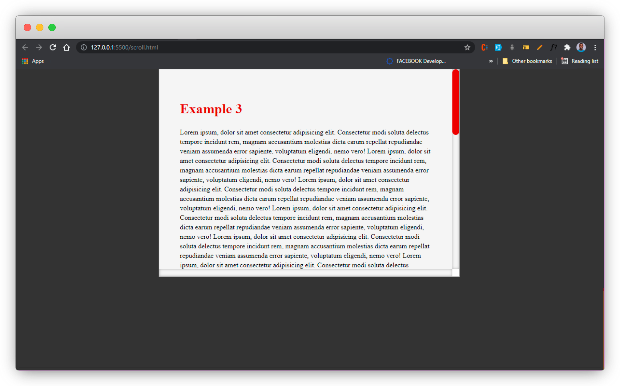
Example 3
📢 Set the viewport of the code pen to 0.5x for a better view
Code 👇
body::-webkit-scrollbar {
width: 1em;
}

body::-webkit-scrollbar-track {
-webkit-box-shadow: inset 0 0 6px rgba(0, 0, 0, 0.3);
}

body::-webkit-scrollbar-thumb {
outline: 3rem solid #333333;
background-color: #f5f5f5;
}
Output 👇
Example 4
📢 Set the viewport of the code pen to 0.5x for a better view
Code 👇
h1 {
color: #d62929;
background: -webkit-linear-gradient(
90deg,
transparent,
magenta,
red,
yellow,
limegreen,
turquoise,
blue,
magenta,
transparent
);
-webkit-background-clip: text;
-webkit-text-fill-color: transparent;
}

/* Main scrollbar styles */
body::-webkit-scrollbar {
width: 1em;
}

body::-webkit-scrollbar-track {
-webkit-box-shadow: inset 0 0 6px rgba(0, 0, 0, 0.3);
}

body::-webkit-scrollbar-thumb {
border-radius: 10px;
background-image: linear-gradient(
90deg,
transparent,
magenta,
red,
yellow,
limegreen,
turquoise,
blue,
magenta,
transparent
);
}
Output 👇

Let's make it more lively by setting images as our scroll bar thumb 🤩
Example 5
📢 Set the viewport of the code pen to 0.5x for a better view
📢 Set the viewport of the code pen to 0.5x for a better view
Code 👇
h1 {
color: blue;
}

/* Main scrollbar styles */
body::-webkit-scrollbar {
width: 2em;
}

body::-webkit-scrollbar-track {
-webkit-box-shadow: inset 0 0 6px rgba(0, 0, 0, 0.3);
}

body::-webkit-scrollbar-thumb {
background-image: url("https://encrypted-tbn0.gstatic.com/images?q=tbn:ANd9GcS3qXezdXaectR_LXKKMYd1Qi8cgUV3VgP9gHJhbY8w9bAoXZjgWo6y8CSgGvKYcEhmHqA&usqp=CAU"),
    linear-gradient(100deg, transparent, transparent);
background-position: center bottom, center -40px;
background-repeat: no-repeat, no-repeat;
background-size: contain, contain;
}
Output 👇

Example 6
📢 Set the viewport of the code pen to 0.5x for a better view
Code 👇
h1 {
color: grey;
}

body::-webkit-scrollbar {
width: 3em;
}

body::-webkit-scrollbar-track {
-webkit-box-shadow: inset 0 0 6px rgba(0, 0, 0, 0.3);
}

body::-webkit-scrollbar-thumb {
background-image: url("https://www.pngitem.com/pimgs/m/421-4218752_angry-mouse-gif-clipart-computer-mouse-animated-film.png"),
linear-gradient(100deg, transparent, transparent);
background-position: center bottom, center -40px;
background-repeat: no-repeat, no-repeat;
background-size: contain, contain;
}
Output 👇

Example 7
📢 Set the viewport of the code pen to 0.5x for a better view
Code 👇
h1 {
color: green;
}

body::-webkit-scrollbar {
width: 4em;
}

body::-webkit-scrollbar-track {
-webkit-box-shadow: inset 0 0 6px rgba(0, 0, 0, 0.3);
}

body::-webkit-scrollbar-thumb {
background-image: url("https://media.istockphoto.com/photos/blocks-picture-id172801980?k=6&m=172801980&s=612x612&w=0&h=MfOaUeOAVw6rRCtynFN8zFNYsuQYsLn0fQvp80JK_Io="),
linear-gradient(100deg, transparent, transparent);
background-position: center bottom, center -40px;
background-repeat: no-repeat, no-repeat;
background-size: contain, contain;
}
Output 👇

YES!!! we can also use our favorite gif as our scroll bar thumb 🤩
Example 8
📢 Set the viewport of the code pen to 0.5x for a better view
Code 👇
h1 {
color: #333333;
}

body::-webkit-scrollbar {
width: 3em;
}

body::-webkit-scrollbar-track {
-webkit-box-shadow: inset 0 0 6px rgba(0, 0, 0, 0.3);
}

body::-webkit-scrollbar-thumb {
background-image: url("https://img1.picmix.com/output/stamp/normal/7/2/8/0/1200827_0898c.gif"),
    linear-gradient(100deg, transparent, transparent);
background-position: center bottom, center -40px;
background-repeat: no-repeat, no-repeat;
background-size: contain, contain;
}
Output 👇

Example 9
📢 Set the viewport of the code pen to 0.5x for a better view
Code 👇
h1 {
color: tomato;
}

body::-webkit-scrollbar {
width: 3em;
}

body::-webkit-scrollbar-track {
-webkit-box-shadow: inset 0 0 6px rgba(0, 0, 0, 0.3);
}

body::-webkit-scrollbar-thumb {
background-image: url("https://i.pinimg.com/originals/b5/2e/1b/b52e1bff41122d66aac6133d5718b6fb.gif"),
linear-gradient(100deg, transparent, transparent);
background-position: center bottom, center -40px;
background-repeat: no-repeat, no-repeat;
background-size: contain, contain;
}
Output 👇

Example 10
📢 Set the viewport of the code pen to 0.5x for a better view
Code 👇
h1 {
color: purple;
}

body::-webkit-scrollbar {
width: 3em;
}

body::-webkit-scrollbar-track {
-webkit-box-shadow: inset 0 0 6px rgba(0, 0, 0, 0.3);
}

body::-webkit-scrollbar-thumb {
background-image: url("https://thumbs.gfycat.com/ShyAdventurousAsianporcupine-max-1mb.gif"),
linear-gradient(100deg, transparent, transparent);
background-position: center bottom, center -40px;
background-repeat: no-repeat, no-repeat;
background-size: contain, contain;
}
Output 👇

Wow, what a journey, I am glad you made it to the end of this article, and that you have learned one or two things on how to customize a browser scrollbar, kindly use the gif and animation wisely as this might distract users. Let me know in the comment section which of the above examples stood out for you 😉.
If you enjoyed reading this article and found it helpful, I will like to connect with you.
Let's connect on
See you in the next article. Bye Bye 🙋♂️
If you like my content, you can also support my blog below.
Enjoyed this article?
Subscribe to my YouTube channel for coding tutorials, live project builds, and tech discussions.
Subscribe